
Embedded Design Maker Documentation | Printful (1.8.0)
Download OpenAPI specification:Download
⚠️ Important Disclaimer: Before you can access the Embedded Design Maker (EDM) functionality, you must first request access through our enterprise form. Please visit https://www.printful.com/enterprise/embedded-design-maker to submit your request for EDM access.
This is a tutorial for developers/maintainers of the web page that explains how to integrate Printful Embedded Design Maker in a website.
General workflow how to integrate Printful Design Maker in your website:
Register your app in https://developers.printful.com and create authentication tokens to be able to access Printful resources.
Authenticate from your app by calling API endpoints with these tokens to gather all needed data for Printful Design Maker.
Include our JS file in your website and create Printful Design Maker instance.
Get list of created designs, generate mockups and create orders from your website by calling Printful API endpoints.
Printful Developers portal is the place where you can setup OAuth access tokens to be able to access Printful resources.
Log in Printful Developers portal using your Printful login credentials.
You need a private OAuth access token to call most Printful API endpoints.
- To create an access token click on "Add new token" button in the "Tokens" section.
- Set the name, contact info and expiration date of the token.
- Set access level depending on your needs - choose "Account (all stores)" to grant access for an account (all stores) or limit the access level to a single selected store.
- Select scopes for the private token.
See detailed info in the Authentication section of Printful Developers portal to get more info about the scopes and access levels.
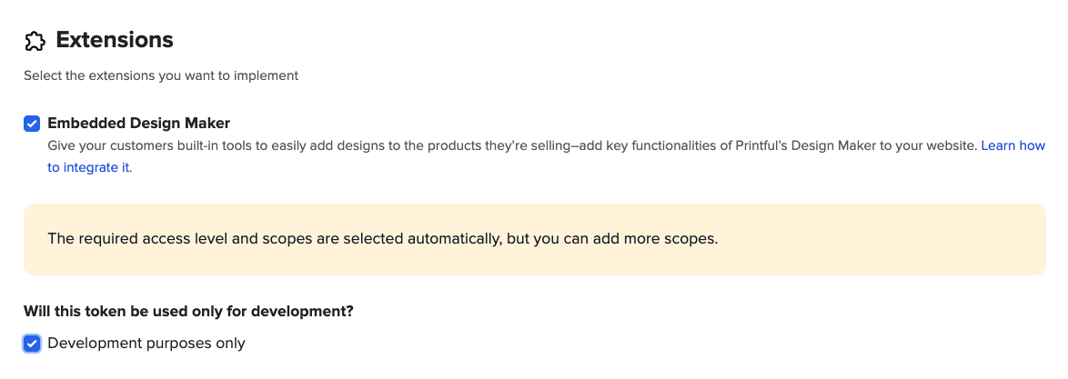
To work with Embedded Design Maker, you will need at least one token with "Embedded Designer" extension. You will use this token to get the Nonce token that is needed to open Printful Design Maker instance.
In the "Extensions" section there should be a checkbox "Embedded Design Maker" - once you check it - The access level and Scopes section will set up automatically with the needed values for Embedded Design Maker.
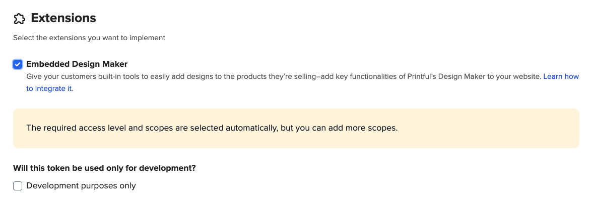
Important - for the Embedded Desing Maker please create 2 separate private tokens for different purposes:
- For development purposes, implementation, testing of new features and products:
- Private token with the Embedd Desing Maker and “development purposes only” selected.
- Private token with the Embedd Desing Maker and “development purposes only” selected.
- For the live environment and production usage please use:
- Private token with only the Embedd Desing Maker extension selected
- Private token with only the Embedd Desing Maker extension selected
If you need additional Scopes for the token, to call some other API endpoints that need additional scopes, you can check them as well and have a single token for multiple needs, but it is possible to create a new token for every single API endpoint as well. More info on what scopes are needed for each endpoint can be found in the Embedded designer related API calls section.
Note - once the token is created the scopes list is fixed and cannot be edited. We suggest to enable all available scopes for the token.
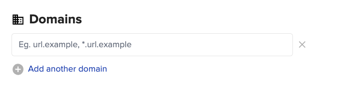
To ensure that Printful will only listen to messages that comes from your domain names and ignore all other, enter your domain name in the "Domains" section.
To get the Nonce token which is used to access the designer iframe session for a specific template, send a POST request authenticated by the access token with the "Embedded Designer" extension to the following endpoint: https://api.printful.com/embedded-designer/nonces.
The endpoint accepts a JSON object with following fields:
| Field | Type | Required | Description |
|---|---|---|---|
external_product_id |
String | Yes | External merchant-side product ID unique for the template |
external_customer_id |
String or Null | No | External merchant-side identifier of the end-user |
ip_address |
String or Null | No | The IP address that will be used to open the iframe for additional validation |
user_agent |
String or Null | No | The user agent that will be used to open the iframe for additional validation |
The ip_address and user_agent fields may be used to limit the usage of the nonce. If they are present
and not null, only a request with a matching IP address/User agent will be permitted with the given nonce.
The response will be a JSON object with a following structure:
{
    "code": 200,
    "result": {
        "nonce": Nonce
    }
}
The Nonce object fields are described in the following table:
| Field | Type | Description |
|---|---|---|
nonce |
String | The nonce value |
template_id |
integer or null | The ID of a Printful template associated with the nonce. If a new template is to be created, this will be null |
expires_at |
integer | The UNIX timestamp at which the nonce will expire |
The endpoint generation request should be done from the back-end, to not expose the access token to the users.
The nonce will be used to authenticate the iframe session and all actions done in the embedded designer session. With each usage of the nonce, its duration will be extended.
Generating a new nonce for a given external product ID will invalidate the previous nonces generated for the same external product ID.
Saving the template will also invalidate the nonce. To edit the template, a new nonce will need to be generated.
To open the Embedded DesignMaker and create new Embedded template you have to follow these steps.
First thing you need is to include file embed.js in your website. This file contains the Embedded Design Maker Manager PFDesignMaker class definition.
You need to use a script tag to load this class definition from a CDN server to your website:
<script src="https://files.cdn.printful.com/embed/embed.js"></script>
To get the latest version of this file use this URL: https://files.cdn.printful.com/embed/embed.js
After you have included embed.js file in your website, you can create Embedded Design Maker Manager class PFDesignMaker instance.
Here is a simple example, of how to create this instance with all the required params:
this.designMaker = new PFDesignMaker({
    elemId: 'my-designer',
    nonce: 'ec7kkhxcx6ykjlb2718kzzbgu353y7on',
    externalProductId: 'mug-123',
    initProduct: {
        productId: 438,
    },
});
Info about the all possible properties that can be passed while creating this instance object:
| Prop name | Type | Description |
|---|---|---|
elemId |
String | Required id of the DOM element in your webpage that will contain the iframe element with Printful Design Maker. You have to have an element with this id in your webpage. |
nonce |
String | Required nonce authentication token to prove that you are eligible to access Printful Design Maker. To get the nonce authentication token you have to follow the instructions of the How to get Nonce token for Embedded designer section |
externalProductId |
String | Required id of the embedded template that you are creating. Generate and manage this id on your own website according to your needs. When the design will be saved, use this id to edit the design, or make order from it. Make sure that this id is not used for any other already saved template item when passing this to create new embedded template design. |
onTemplateSaved |
Function | Required Function to be called when Embedded Template has been saved. templateId is passed as a param for this function. Store templateId and use it later to edit existing design |
onDesignStatusUpdate |
Function | Optional Function to be called when Embedded Designer design status has been changed. There is one object property with five values that gets passed. See section onDesignStatusUpdate method - call logic and returned data structure for more info |
initProduct |
Object | Required to open design maker in "Create new template" mode Object with information about the product from the Printful product catalog. See table below for more details. To get all the needed product data you have to follow the instructions of the Catalog API. See section initProduct data structure for more info |
onIframeLoaded |
Function | Optional Function to be called when iframe URL has been loaded and it is safe to make DOM element visible to the user. |
onError |
Function | Optional Function to be called when any kind of error has happened. |
iframeClassName |
String | Optional Add className for iframe DOM element, in case you need to add custom styling for it. |
debug |
Boolean | Optional Specify true for additional debugging output in form of console logs. |
style |
Object | Optional Specify custom styles to be passed to the Embedded Design Maker to style tha design maker UI according to your needs. See section "style" data structure for more info |
featureConfig |
Object | Optional Specify custom feature configuration for Embedded Design Maker to restrict some Design Maker features (layer types). See section "featureConfig" data structure for more info |
disabledPlacements |
String[] | Optional An array of placement ids that should not be available for designing. if param is ommitted or empty array is passed, then all placements will be available. Specify only in case you want to disable some of the placements, otherwise omit this parameter. . See section "disabledPlacements" array for more info |
preselectedColors |
String[] | Optional An array of Product color names that will be preselected when Embedded Design Maker is opened. If param is ommitted or empty array is passed, default logic will be used. See section "preselectedColors" array for more info |
preselectedSizes |
String[] | Optional An array of Product size names that will be preselected when Embedded Design Maker is opened. If param is ommitted or empty array is passed, default logic will be used. See section "preselectedSizes" array for more info |
preselectedProductOptions |
Object | Optional Specify preselected product options. If not specified, then default ones will be used. If no values are selected relevant error message is shown. See section "preselectedProductOptions" data structure for more info |
disabledColors |
String[] | Optional An array of Product color names that will be disabled for Embedded Design Maker. If param is ommitted or empty array is passed, default logic will be used. See section "disabledColors" array for more info |
disabledSizes |
String[] | Optional An array of Product size names that will be disabled for Embedded Design Maker. If param is ommitted or empty array is passed, default logic will be used. See section "disabledSizes" array for more info |
applyImageFromUrl |
String | Optional A string with URL of JPG or PNG image file that should be applied to new product. See section applyImageFromUrl parameter for more information. |
Example with basic setup and default configuration values:
    this.designMaker = new PFDesignMaker({
        elemId: 'my-designer',
        nonce: 'ec7kkhxcx6ykjlb2718kzzbgu353y7on',
        externalProductId: 'mug-123',
        initProduct: {
            productId: 438,
        },
        locale: 'en_US',
        disabledPlacements: [],
        isVariantSelectionDisabled: false,
        disabledColors: [],
        disabledSizes: [],
        preselectedColors: [],
        preselectedSizes: [],
        preselectedProductOptions: {},
        applyImageFromUrl: '',
        useUserConfirmationErrors: false,
        allowOnlyOneColorToBeSelected: false,
        allowOnlyOneSizeToBeSelected: false,
        useEmbroideryPreviewInDesign: false,
        featureConfig: {
            clipart_layers: true,
            file_layers: true,
            text_layers: true,
            embroidery_3d_puff: true,
            has_color_group_inside_labels: false,
            sub_technique_switcher: false,
            has_external_user_file_library: false,
            show_unavailability_info: false,
            custom_external_file_library: false,
            initial_open_view: ''
        },
        livePricingConfig: {
            useLivePricing: false,
            useAccountBasedPricing: false,
            showPricesInPlacementsTabs: true,
            livePricingCurrency: 'USD'
        }
    })
Product info object initProduct can have following properties:
| Prop name | Type | Example values | Description |
|---|---|---|---|
productId |
number | Required Product ID from the Product catalog API | |
technique |
String | T-SHIRT, EMBROIDERY, etc. |
Optional Technique for the products that can have more than one default technique |
forceOrientation |
String | horizontal, vertical |
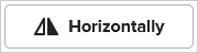
Optional Orientation for products that can have more than one orientation template types (socks, tote bags) |
For some products that have 'Unlimited Colors' embroidery technique available (Product containing Unlimited Color option), it is possible to initialise product in designer in full_color mode by passing EMBROIDERY_FULL_COLOR as technique.
Custom styling object style can have following properties and data structure:
| Prop name | Type | Description |
|---|---|---|
variables |
Object | List of key, value pairs, where the key is any valid CSS property and the value is any valid CSS value. All CSS declarations defined here will be applied to :root selector. There is a list of predefined custom CSS properties. See section Customization for more info |
navigation.product.imageIcon |
String | Desktop:  Mobile: Mobile:  URL for navigation button product icon, if image fails to load, default icon will be used. Image will be resized to 24x24px |
navigation.design.imageIcon |
String | Mobile:  URL for navigation button design icon, if image fails to load, default icon will be used. Image will be resized to 24x24px |
navigation.layers.imageIcon |
String | Desktop:  Mobile: Mobile:  URL for navigation button layers icon, if image fails to load, default icon will be used. Image will be resized to 24x24px |
navigation.file.imageIcon |
String | Desktop:  Mobile: Mobile:  URL for navigation button file icon, if image fails to load, default icon will be used. Image will be resized to 24x24px |
navigation.text.imageIcon |
String | Desktop:  Mobile: Mobile:  URL for navigation button text icon, if image fails to load, default icon will be used. Image will be resized to 24x24px |
navigation.clipart.imageIcon |
String | Desktop:  Mobile: Mobile:  URL for navigation button clipart icon, if image fails to load, default icon will be used. Image will be resized to 24x24px |
navigation.fill.imageIcon |
String | Desktop:  Mobile: Mobile:  URL for navigation button fill icon, if image fails to load, default icon will be used. Image will be resized to 24x24px |
(deprecated) background |
String | Use --pf-sys-background, see general background related tokenscolor, valid RGB, RGBA, HSL, HSLA color values and CSS4 Hex notation |
(deprecated) textColor |
String | Use any "on-background" or "on-surface", see neutral colors on backgroundcolor, valid RGB, RGBA, HSL, HSLA color values and CSS4 Hex notation |
(deprecated) iconColor |
String | Use --pf-sys-icon-on-background, see general background related tokenscolor, valid RGB, RGBA, HSL, HSLA color values and CSS4 Hex notation |
(deprecated) link.color |
String | Use --pf-sys-link-on-background, see general background related tokenscolor, valid RGB, RGBA, HSL, HSLA color values and CSS4 Hex notation |
(deprecated) picker.background |
String | color, valid RGB, RGBA, HSL, HSLA color values and CSS4 Hex notation |
(deprecated) layer.background |
String | Use --pf-comp-layer-item-surface, see layercolor, valid RGB, RGBA, HSL, HSLA color values and CSS4 Hex notation |
(deprecated) layer.textColor |
String | Use --pf-comp-layer-item-on-surface, see layercolor, valid RGB, RGBA, HSL, HSLA color values and CSS4 Hex notation |
(deprecated) layer.iconColor |
String | color, valid RGB, RGBA, HSL, HSLA color values and CSS4 Hex notation |
If you have provided a method in onDesignStatusUpdate param - this method is called each time there are some updates regarding design status. To avoid calling this method too often when multiple things change at once - all method calls are debounced with time limit 1000ms - meaning that the design status update message will be sent 1000ms after the last design status change.
Possible events that trigger design status update are:
- Design has been changed compared to how it was opened - in case already saved template is opened
- There are some validation errors, that restrict user from saving the design with current configuration
- List of selected sizes/colors for the product has changed
- List of used placement has changed
- Sub technique switch
| Prop name | Type | Description |
|---|---|---|
designChange |
Boolean | Indicating if design has been changed if compared to how it was opened. True if the design has been changed, otherwise false. |
designValid |
Boolean | Indicating if it is possible to save the design currently. If the value is false - it means that there will be some validation error that will restrict user from saving the design |
selectedVariantIds |
array |
An array of selected product variant ids. A product variant is combination of size/color for the product. For example if user has selected 2 colors and 5 sizes, then this array should contain 10 product variant ids (all the size/color combinations 2*5=10) |
usedPlacements |
array |
An array of placement ids that have some design added. |
subtechnique |
String | Indicates which sub technique is active |
errors |
array |
An array of error messages that decribe why design is not valid |
FeatureConfig data object 'featureConfig' can have following properties to control witch layer types/designer features are allowed in the Design Maker:
| Prop name | Type (Default) | Description |
|---|---|---|
clipart_layers |
Boolean (true) |
Set if the clipart layers can be added while creating the design (visibility of the "Add clipart" button) |
file_layers |
Boolean (true) |
Set if the file layers can be added while creating the design (visibility of the "Choose file" button) |
text_layers |
Boolean (true) |
Set if the text layers can be added while creating the design (Visibility of the "Add text" button) |
embroidery_3d_puff |
Boolean (true) |
Set if the 3D puff can be added to file layers for certain embroidery products (Visibility of the "Embroidery type" picker) |
has_color_group_inside_labels |
Boolean (false) |
Set if the insade label placement should have customization options for mandatory data design. Designs created with this option must be ordered specifying product template or external product ID, not by printfiles from mockup generation. |
sub_technique_switcher |
Boolean (false) |
Set if sub technique switcher should be visible (if set true but product does not have sub technique option, switcher wont appear) |
has_external_user_file_library |
Boolean (false) |
Set if users should be able to see their used files in file library modal window. (Has effect only if external_customer_id value is passed on the Nonce token creation that is used for EDM) |
initial_open_view |
String ("file_layers") |
Set to change initial left side view for new design creation. Available options: "file_layers", "clipart_layers", "layers_view", "product_view". |
show_unavailability_info |
Boolean (false) |
Set if unavailability list should appear for selected variants in case some of them are not available. Unavailability list |
custom_external_file_library |
Boolean (false) |
Set if custom file library is required Custom external file library |
In case has_external_user_file_library is used and ADMIN user needs to open other user designs, then for ADMIN user nonce creation:
external_customer_idis not used. That way ADMIN user can open and edit design, but file library won't be accessible because that needsexternal_customer_id.external_customer_idis the same as thecustomer_idthat was used to create design. That way ADMIN user is impersonating user and can edit design, and access user's file library.
- This param should be used in case you want to disable specific placements from Design Maker
disabledPlacementsarray should contain placementId String values, separated by comma.- If the param is omitted or is an empty array, then all placements will be available
- example param values:
['embroidery_chest_left']['back','sleeve_left','sleeve_right']['embroidery_left','embroidery_right']
- If none of the provided Strings match any placementsId of the opened product then this param has no effect - all the placements will be available
- example param values:
- This param will work for both modes "Create new template" and "Edit existing template" mode.
- In "Edit existing template" mode, if opened template contains any design for the placement that is not hidden, then all the design in that placement will be deleted (after the Save action will be called)
- For technical reasons placement 'embroidery_large_center' will always be hidden, if there is such a placement for the loaded product. This is just a temporary restriction - until the technical reasons will be solved
- This param should be used in case you want to have specific Product colors preselected when opening Design Maker
preselectedColorsarray should contain Product color name string values, separated by comma.- If the param is omitted or is an empty array, default logic will be used.
- example param values:
['Black Heather','Autumn','Aqua','Mauve']['Oxblood Black','Heather Raspberry','Heather True Royal']['Heather True Royal']
- If none of the provided Strings match any Product color names of the opened product available colors then this param has no effect - default logic will be used instead.
- example param values:
- This param will only work for "Create new template" mode.
- If passed color name is not found in current product config, it will be ignored
- This param should be used in case you want to have specific Product sizes preselected when opening Design Maker
preselectedSizesarray should contain Product size name string values, separated by comma.- If the param is omitted or is an empty array, default logic will be used.
- example param values:
['XS','S','M']['XL']['2XL','3XL','4XL','5XL']
- If none of the provided Strings match any Product size names of the opened product available sizes then this param has no effect - default logic will be used instead.
- example param values:
- This param will only work for "Create new template" mode.
- If passed size name is not found in current product config, it will be ignored
- This param should be used in case you want to have preselected product options. This works only if product supports these options and passed values.
- Check Utilising Options to see if product has product options and what kind of values it supports.
- Sometimes default values are
null, if thats the case then end-user needs to select product options via Design Maker. End-user can't save design without values in product options. If no values are selected relevant error message is shown that stops user from saving template. preselectedProductOptionsobject has key as product option name and value as product option value. See table for supported product options:
| Prop name | Type | Description |
|---|---|---|
stitchColor |
String | Set stitch color for the product. Typically the value can be white, black, clear. |
insidePocket |
Boolean ( false) |
Set if product should have inside pocket. By default this is false. |
customBorderColor |
String | Set border color in hex for the product. This is for Stickers. |
- If wrong key gets passed, it will be ignored.
- If wrong value gets passed, it will be ignored.
- This param should be used in case you want to have specific Product colors disabled for Embedded Design Maker
disabledColorsarray should contain Product color name string values, separated by comma.- If the param is omitted or is an empty array, default logic will be used.
- example param values:
['Black Heather','Autumn','Aqua','Mauve']['Oxblood Black','Heather Raspberry','Heather True Royal']['Heather True Royal']
- If none of the provided Strings match any Product size names of the opened product available sizes then this param has no effect - default logic will be used instead.
- example param values:
- If passed size name is not found in current product config, it will be ignored
- This param should be used in case you want to have specific Product sizes disabled for Embedded Design Maker
disabledSizesarray should contain Product size string values, separated by comma.- If the param is omitted or is an empty array, default logic will be used.
- example param values:
['XS','S','M']['XL']['2XL','3XL','4XL','5XL']
- If none of the provided Strings match any Product sizes of the opened product available sizes then this param has no effect - default logic will be used instead.
- example param values:
- If passed size name is not found in current product config, it will be ignored
If applyImageFromUrl string was provided for the PFDesignMaker instance on new product creation, then image from URL will be added to first design placement without manual interactions from the end user.
- This parameter will work only for new product design creation.
- JPG or PNG image must be available from the passed URL so that can be processed and applied to design.
- Restrictions for the image and URL are noted in Send message - Add image from URL trigger section.
- Image can also be added to design placement while designer is open with
setUrlImageLayermessage.
When EDM opens up and selected product has no variants available, unavailability overlay with message appears. When this overlay appears, EDM becomes unusable.
When overlay triggers it will also pass an error to onDesignStatusUpdate with string This product isn’t available.

When user selects variant that is currently out of stock or is discontinued, list will appear with all the selected variants that have this issue.
By default, this option is disabled, to enable it set show_unavailability_info to true in Feature Config

With Add image from URL trigger its possible to add images to EDM,
but it might be wierd to trigger this method with file selector that is outside EDM, with setting custom_external_file_library to true, when user clicks on any file upload option in EDM,
it will trigger onFilePickerRequested hook instead of calling EDM file upload methods.
By combining onFilePickerRequested hook and setUrlImageLayer event, it's possible to show custom file library instead of showing EDM file library
Example usage:
    this.designMaker = new PFDesignMaker({
        elemId: 'my-design-maker',
        nonce: 'ec7kkhxcx6ykjlb2718kzzbgu353y7on',
        featureConfig: {
            custom_external_file_library: true,
        },
        onFilePickerRequested: () => {
            // Logic for opening custom file library
            // Method for picking file from that library
            this.designMaker.sendMessage({
                event: 'setUrlImageLayer',
                imageUrl, // chosen file url
            }); // Call this from the method that chooses the file
        },
    });
To change a locale use locale: 'en_US'
It will translate the EDM UI to selected locale, will also translate warnings and errors returned from onDesignStatusUpdate hook.
Possible values: en_US, it_IT, fr_FR, es_ES, de_DE, ja_JP.
Example usage:
    this.designMaker = new PFDesignMaker({
        elemId: 'my-design-maker',
        nonce: 'ec7kkhxcx6ykjlb2718kzzbgu353y7on',
        locale: 'en_US',
    });
To disable variant selection use isVariantSelectionDisabled: true
Will still show all possible colors and sizes for a product, but will disable option to select any colors or sizes.
Useful if it should not be possible to edit selected colors or sizes when editing previously saved design.
Example usage:
    this.designMaker = new PFDesignMaker({
        elemId: 'my-design-maker',
        nonce: 'ec7kkhxcx6ykjlb2718kzzbgu353y7on',
        isVariantSelectionDisabled: true,
    });
To make it so that customer can select only one color use allowOnlyOneColorToBeSelected: true
Useful for using EDM as an order creation tool.
Recommended to use along with "Limit size selection to one"
Example usage:
    this.designMaker = new PFDesignMaker({
        elemId: 'my-design-maker',
        nonce: 'ec7kkhxcx6ykjlb2718kzzbgu353y7on',
        allowOnlyOneColorToBeSelected: true,
    });
To make it so that customer can select only one size use allowOnlyOneSizeToBeSelected: true
Useful for using EDM as an order creation tool.
Recommended to use along with "Limit color selection to one"
Example usage:
    this.designMaker = new PFDesignMaker({
        elemId: 'my-design-maker',
        nonce: 'ec7kkhxcx6ykjlb2718kzzbgu353y7on',
        allowOnlyOneSizeToBeSelected: true,
    });
There can be some errors that in regular Designmaker in Printful ask for user feedback to be resolved, for example modal for selecting AOP product stitch color if user did not select one.
In EDM such errors are just passed in onDesignStatusUpdate
But it's possible to enable the modal flow instead of just passing some error to onDesignStatusUpdate with useUserConfirmationErrors: true
Example usage:
    this.designMaker = new PFDesignMaker({
        elemId: 'my-design-maker',
        nonce: 'ec7kkhxcx6ykjlb2718kzzbgu353y7on',
        useUserConfirmationErrors: true,
    });
With useUserConfirmationErrors: false if user has not selected stitch color:
With useUserConfirmationErrors: true if user has not selected stitch color and tries to save design:
To get current design pricing range, use livePricingConfig and onPricingStatusUpdate hook.
onPricingStatusUpdate will provide each selected variants price and even include additional placement price.
Available currencies: "USD", "EUR", "JPY", "GBP", "CAD", "AUD", "SEK", "DKK", "NZD", "CHF", "MXN", "HKD", "SGD", "NOK", "PLN", "KRW", "BRL";
Data format returned from onPricingStatusUpdate
export interface PricingInfo {
    discountPercent: number;
    discountedPrice: number;
    discountAmount: number;
    currency: string;
    currencySymbol: string;
    price: number;
    originalPrice: number;
    retailPrice: number;
    basePriceDiscount: number;
    growthPrice: number;
    color: string;
    size: string;
}
Example config:
    this.designMaker = new PFDesignMaker({
        elemId: 'my-design-maker',
        nonce: 'ec7kkhxcx6ykjlb2718kzzbgu353y7on',
        livePricingConfig: {
            useLivePricing: true, // Enables the feature
            useAccountBasedPricing: false, // If true, gets discounts if EDM owner account has Printful Growth enabled
            showPricesInPlacementsTabs: true, // If true, will show prices in placement tabs
            livePricingCurrency: "USD" // Currency to show and use
        },
        onPricingStatusUpdate: (variantPriceList) => {
            // logic that handles pricing logic
        }
    });
There are some limitations as to what kind of templates EDM can edit.
If a product template is created with https://printful.com, you will not be able to edit or open such templates in EDM.
Templates created with EDM, are not visible in https://printful.com dashboard.
To edit a template follow this flow:
- Create a template reference on your side (
external_product_id) - Create a nonce with said
externalProductId(More details here), example request:POST https://api.printful.com/embedded-designer/nonces Authorization: Bearer {token} Content-Type: application/json { "external_product_id": "myRandomlyGeneratedId1" } - Create the EDM instance, example code:
this.designMaker = new PFDesignMaker({ elemId: 'my-designer', nonce: 'ec7kkhxcx6ykjlb2718kzzbgu353y7on', // nonce returned from step 2 externalProductId: 'myRandomlyGeneratedId1', // Your generated ID initProduct: { productId: 438, // Whatever product you wish to open }, }); - Save design
- To edit the saved design, create nonce again, but instead of generating new
external_product_id, use the same one that was used when initial nonce was created - Create a new EDM instance, but now don't add
initProduct, example code:this.designMaker = new PFDesignMaker({ elemId: 'my-designer', nonce: 'uMZHeuNEYM8nsjqzf0JAFUsglvurf5EA', // nonce returned from step 5 externalProductId: 'myRandomlyGeneratedId1', // Your previously used id from step 1 ID });
Now if everything went correctly, EDM should open design that was saved during step 4.
To be able to trigger events in Embedded Design Maker, use public method sendMessage of the PFDesignMaker instance object.
Method has only one parameter message type Object. See the example usage of this method - to trigger save design action in Embedded Design Maker:
this.designMaker.sendMessage({ event: 'saveDesign' });
saveDesign - Call this event to trigger save action on Embedded Design Maker.
- If Design Maker is opened in "Create new template" mode, then save action will create new Embedded Template
- if Design Maker is opened in "Edit existing template" mode then save action will update design for existing template.
Example code
this.designMaker.sendMessage({ event: 'saveDesign' });
Notes
If onTemplateSaved function was provided for the PFDesignMaker instance, and the save action was successful,
then onTemplateSaved callback function will be called after triggering saveDesign event.
setUrlImageLayer - Call this event to trigger image adding to active placement on Embedded Design Maker.
- There are limitations to passed URL:
- URL must point to PNG/JPG image that can be processed from passed string,
- Max URL length is 1000 characters,
- Recommended max size for one image dimension is 15k pixels,
- Image size must be smaller than 50MB,
- Maximum of 5 file image layers can be applied to one placement.
- Image will be applied to the opened design placement.
- If file can not be processed, a console error will be shown.
Example code
this.designMaker.sendMessage({ event: 'setUrlImageLayer', imageUrl: 'https://picsum.photos/2000' });
Notes
To add image from URL automatically after new product is opened applyImageFromUrl parameter can be used.
The first time image is retrieved it will be saved for future use. When using the same URL for future requests the cached image will be used.
If has_external_user_file_library parameter ("featureConfig" data structure) is used, end user will see file in library.
- Accessibility
- Color contrast
- Consideration: When modifying predefined custom CSS properties that are listed below, Printful is not responsible for meeting the accessible color contrast values
- Solution: Ensure that the custom design system colors meet minimum accessible color contrast. More information about Text has minimum contrast WCAG rule (external link)
- Color contrast
- Custom SVG illustrations
- Consideration: Custom SVG illustrations (e.g. in "not results found" search views) are not customizable and may not look good on every background color
- Solution: Custom SVG illustrations will work best with a light theme
| On light background | On dark background |
|---|---|
 |
 |
- Changing container component specific surface color with unpredictable content (e.g. dropdown and popover)
- Consideration: Almost all container components (e.g. dropdowns and popovers) use the same surface color as the page background, white by default. If you want to change surface color for a specific component (e.g. popover) to be different from page background color, depending on content inside popover, the colors inside popover might not be customizable. In most cases it should be fine, but there could be cases where customization options are limited on component level.
- Solution: For container components (e.g. dropdowns and popovers) most reliable results will be if the container component surface is the same color as page background color
In the example below, the popover surface and text colors are changed. The toggle switch can't be adjusted for popover specifically
| Popover with white surface | Popover with custom surface |
|---|---|
 |
 |
- Loading spinner customization
- Consideration: Currently it's not possible to change colors for the loading spinner
- Solution: The loading spinner will work best with a light theme
| Loading spinner on white background | Loading spinner on dark background |
|---|---|
 |
 |
- Non-customizable cliparts
- Consideration: When changing page background color, some clipart colors may clash with the background
- Solution: Cliparts will work best with a light theme
| Non-customizable cliparts on white background | Non-customizable cliparts on dark background |
|---|---|
 |
 |
Dark mode
When changing to dark mode, use dark color scheme in CSS to make the operating system adjust the user interface (e.g. make scrollbars and native form controls dark)
More info on CSS color-scheme property - https://developer.mozilla.org/en-US/docs/Web/CSS/color-scheme
new PFDesignMaker({
    style: {
        variables: {
            'color-scheme': 'dark',
        },
    },
});
Accent color
Change the accent color of user-interface controls (e.g. checkboxes, radio buttons)
More info on CSS accent-color property - https://developer.mozilla.org/en-US/docs/Web/CSS/accent-color
new PFDesignMaker({
    style: {
        variables: {
            'accent-color': '#222222',
        },
    },
});
Example usage
new PFDesignMaker({
    style: {
        variables: {
            '--pf-sys-background': '#222222',
        },
    },
});
If the custom CSS property value references another custom CSS property, you can omit the declaration and the value will be inherited from the referenced property. However, you can override those properties to be more specific.
Note: Following example is not comprehensive and complete and is meant to be used as a starting point to build upon
| Light mode | Dark mode |
|---|---|
 |
 |
new PFDesignMaker({
    style: {
        variables: {
            '--pf-sys-background': '#0f172a',
            '--pf-sys-background-hsl': '222.22, 47.37%, 11.18%',
            '--pf-sys-neutral-300-on-background': '#64748b',
            '--pf-sys-neutral-400-on-background': '#94a3b8',
            '--pf-sys-neutral-700-on-background': '#e2e8f0',
            '--pf-sys-neutral-800-on-background': '#f1f5f9',
            '--pf-sys-neutral-900-on-background': '#f8fafc',
            '--pf-sys-primary-400-on-background': '#059669',
            '--pf-sys-primary-700-on-background': '#6ee7b7',
            '--pf-sys-border-on-background': '#64748b',
            '--pf-sys-link-on-background': '#93c5fd',
            '--pf-sys-icon-on-background': '#94a3b8',
            '--pf-sys-icon-info-on-background': '#94a3b8',
            '--pf-sys-icon-hover-neutral-700-on-background': '#e2e8f0',
            '--pf-sys-icon-hover-neutral-900-on-background': '#f8fafc',
            '--pf-sys-error-on-background': '#f87171',
            '--pf-sys-success-on-background': '#22c55e',
            '--pf-sys-warning-on-background': '#fcd34d',
            '--pf-sys-hover-border-color-on-background': '#64748b',
            '--pf-sys-hover-box-shadow-on-background': '',
            '--pf-sys-neutral-surface-50': '#1e293b',
            '--pf-sys-neutral-surface-50-hsl': '217.24, 32.58%, 17.45%',
            '--pf-sys-neutral-300-on-surface-50': '#64748b',
            '--pf-sys-neutral-400-on-surface-50': '#94a3b8',
            '--pf-sys-neutral-700-on-surface-50': '#e2e8f0',
            '--pf-sys-neutral-900-on-surface-50': '#f8fafc',
            '--pf-sys-neutral-surface-100': '#334155',
            '--pf-sys-neutral-700-on-surface-100': '#e2e8f0',
            '--pf-sys-neutral-900-on-surface-100': '#f8fafc',
            '--pf-sys-neutral-surface-200': '#475569',
            '--pf-sys-neutral-400-on-surface-200': '#94a3b8',
            '--pf-sys-neutral-900-on-surface-200': '#f8fafc',
            '--pf-sys-neutral-surface-300': '#64748b',
            '--pf-sys-neutral-400-on-surface-300': '#94a3b8',
            '--pf-sys-neutral-900-on-surface-300': '#f8fafc',
            '--pf-sys-neutral-surface-400': '#94a3b8',
            '--pf-sys-neutral-900-on-surface-400': '#f8fafc',
            '--pf-sys-primary-surface-400': '#059669',
            '--pf-sys-primary-surface-700': '#6ee7b7',
            '--pf-sys-primary-on-surface-700': '#134e4a',
            '--pf-sys-error-surface': '#991b1b',
            '--pf-sys-error-on-surface': '#fef2f2',
            '--pf-sys-form-control-indicator-active-surface': '#93c5fd',
            '--pf-sys-form-control-indicator-active-on-surface': '#1e3a8a',
            '--pf-sys-action-button-surface': '',
            '--pf-sys-action-button-on-surface': '#f8fafc',
            '--pf-sys-action-button-hover-surface': '#64748b',
            '--pf-sys-action-button-hover-on-surface': '#f8fafc',
            '--pf-sys-action-button-focus-surface': '',
            '--pf-sys-action-button-focus-on-surface': '#f8fafc',
            '--pf-sys-action-button-selected-surface': '#155e75',
            '--pf-sys-action-button-selected-on-surface': '#ecfeff',
            '--pf-sys-action-button-disabled-surface': '',
            '--pf-sys-action-button-disabled-on-surface': '#94a3b8',
        },
    },
});
| Name | Default value | Value type | Description |
|---|---|---|---|
--pf-sys-background |
 hsl(0, 0%, 100%) |
color, valid RGB, RGBA, HSL, HSLA color values and CSS4 Hex notation | Page background color |
--pf-sys-background-hsl |
0, 0%, 100% |
valid HSL color values, but without hsl() wrapper function |
Page background color in separate HSL values. Used for CSS color values that require a new value to be generated. Value should derive from --pf-sys-background |
--pf-sys-border-on-background |
 --pf-sys-neutral-300-on-background |
color, valid RGB, RGBA, HSL, HSLA color values and CSS4 Hex notation | Border, separator line color on background |
--pf-sys-hover-border-color-on-background |
--pf-sys-border-on-background |
color, valid RGB, RGBA, HSL, HSLA color values and CSS4 Hex notation | Border, separator line color on background when hovering a card like component |
--pf-sys-icon-on-background |
 --pf-sys-neutral-400-on-background |
color, valid RGB, RGBA, HSL, HSLA color values and CSS4 Hex notation | Icon color on background |
--pf-sys-icon-info-on-background |
--pf-sys-icon-on-background |
color, valid RGB, RGBA, HSL, HSLA color values and CSS4 Hex notation | Info icon (used for tooltips) color on background |
--pf-sys-icon-hover-neutral-700-on-background |
 --pf-sys-neutral-700-on-background |
color, valid RGB, RGBA, HSL, HSLA color values and CSS4 Hex notation | Hovered icon color on background |
--pf-sys-icon-hover-neutral-900-on-background |
 --pf-sys-neutral-900-on-background |
color, valid RGB, RGBA, HSL, HSLA color values and CSS4 Hex notation | Hovered icon color on background |
--pf-sys-link-on-background |
 hsl(207.24, 81.72%, 36.47%) |
color, valid RGB, RGBA, HSL, HSLA color values and CSS4 Hex notation | Link color on background |
--pf-sys-hover-box-shadow-on-background |
0 1px 5px 0 rgba(90, 90, 90, .5) |
valid full box-shadow value |
Shadow on background when hovering a card like component |
From lightest (least contrast) to darkest (most contrast) in light theme
These values are also used for all neutrally colored content on all neutral surfaces, if not overridden
| Name | Default value | Value type | Description |
|---|---|---|---|
--pf-sys-neutral-300-on-background |
hsl(0, 0%, 89.8%) |
color, valid RGB, RGBA, HSL, HSLA color values and CSS4 Hex notation | Neutral color on background. Used border on background color |
--pf-sys-neutral-400-on-background |
hsl(0, 0%, 69.41%) |
color, valid RGB, RGBA, HSL, HSLA color values and CSS4 Hex notation | Neutral color on background |
--pf-sys-neutral-700-on-background |
hsl(0, 0%, 33.33%) |
color, valid RGB, RGBA, HSL, HSLA color values and CSS4 Hex notation | Neutral color on background |
--pf-sys-neutral-800-on-background |
 hsl(0, 0%, 21.57%) |
color, valid RGB, RGBA, HSL, HSLA color values and CSS4 Hex notation | Neutral color on background |
--pf-sys-neutral-900-on-background |
hsl(0, 0%, 13.33%) |
color, valid RGB, RGBA, HSL, HSLA color values and CSS4 Hex notation | Neutral color on background. Page text color |
--pf-sys-neutral-900-on-background-hsl |
0, 0%, 13.33% |
valid HSL color values, but without hsl() wrapper function |
Neutral color on background. Used for CSS color values that require a new value to be generated. Value should derive from --pf-sys-neutral-900-on-background |
From lightest (least contrast) to darkest (most contrast) in light theme
| Name | Default value | Value type | Description |
|---|---|---|---|
--pf-sys-neutral-surface-50 |
 hsl(0, 0%, 97.25%) |
color, valid RGB, RGBA, HSL, HSLA color values and CSS4 Hex notation | Neutral surface color |
--pf-sys-neutral-surface-50-hsl |
0, 0%, 97.25% |
valid HSL color values, but without hsl() wrapper function |
Neutral surface color for some elements in separate HSL values. Used for CSS color values that require a new value to be generated. Value should derive from --pf-sys-neutral-surface-50 |
--pf-sys-neutral-300-on-surface-50 |
 --pf-sys-neutral-300-on-background |
color, valid RGB, RGBA, HSL, HSLA color values and CSS4 Hex notation | Neutral color on neutral surface |
--pf-sys-neutral-400-on-surface-50 |
 --pf-sys-neutral-400-on-background |
color, valid RGB, RGBA, HSL, HSLA color values and CSS4 Hex notation | Neutral color on neutral surface |
--pf-sys-neutral-700-on-surface-50 |
 --pf-sys-neutral-700-on-background |
color, valid RGB, RGBA, HSL, HSLA color values and CSS4 Hex notation | Neutral color on neutral surface |
--pf-sys-neutral-900-on-surface-50 |
 --pf-sys-neutral-900-on-background |
color, valid RGB, RGBA, HSL, HSLA color values and CSS4 Hex notation | Neutral color on neutral surface |
From lightest (least contrast) to darkest (most contrast) in light theme
| Name | Default value | Value type | Description |
|---|---|---|---|
--pf-sys-neutral-surface-100 |
 hsl(0, 0%, 95.29%) |
color, valid RGB, RGBA, HSL, HSLA color values and CSS4 Hex notation | Neutral surface color |
--pf-sys-neutral-700-on-surface-100 |
 --pf-sys-neutral-700-on-background |
color, valid RGB, RGBA, HSL, HSLA color values and CSS4 Hex notation | Neutral color on neutral surface |
--pf-sys-neutral-900-on-surface-100 |
 --pf-sys-neutral-900-on-background |
color, valid RGB, RGBA, HSL, HSLA color values and CSS4 Hex notation | Neutral color on neutral surface |
| Name | Default value | Value type | Description |
|---|---|---|---|
--pf-sys-neutral-surface-200 |
 hsl(0, 0%, 92.55%) |
color, valid RGB, RGBA, HSL, HSLA color values and CSS4 Hex notation | Neutral surface color |
--pf-sys-neutral-400-on-surface-200 |
 --pf-sys-neutral-400-on-background |
color, valid RGB, RGBA, HSL, HSLA color values and CSS4 Hex notation | Neutral color on neutral surface |
From lightest (least contrast) to darkest (most contrast) in light theme
| Name | Default value | Value type | Description |
|---|---|---|---|
--pf-sys-neutral-surface-300 |
 hsl(0, 0%, 89.8%) |
color, valid RGB, RGBA, HSL, HSLA color values and CSS4 Hex notation | Neutral surface color |
--pf-sys-neutral-400-on-surface-300 |
 --pf-sys-neutral-400-on-background |
color, valid RGB, RGBA, HSL, HSLA color values and CSS4 Hex notation | Neutral color on neutral surface |
--pf-sys-neutral-900-on-surface-300 |
 --pf-sys-neutral-900-on-background |
color, valid RGB, RGBA, HSL, HSLA color values and CSS4 Hex notation | Neutral color on neutral surface |
| Name | Default value | Value type | Description |
|---|---|---|---|
--pf-sys-neutral-surface-400 |
 hsl(0, 0%, 69.41%) |
color, valid RGB, RGBA, HSL, HSLA color values and CSS4 Hex notation | Neutral surface color |
--pf-sys-neutral-900-on-surface-400 |
 --pf-sys-neutral-900-on-background |
color, valid RGB, RGBA, HSL, HSLA color values and CSS4 Hex notation | Neutral color on neutral surface |
From lightest (least contrast) to darkest (most contrast) in light theme
| Name | Default value | Value type | Description |
|---|---|---|---|
--pf-sys-primary-400-on-background |
 hsl(1.4, 82.61%, 59.41%) |
color, valid RGB, RGBA, HSL, HSLA color values and CSS4 Hex notation | Primary (brand) color on background |
--pf-sys-primary-700-on-background |
 hsl(1.38, 91.6%, 46.67%) |
color, valid RGB, RGBA, HSL, HSLA color values and CSS4 Hex notation | Primary (brand) color on background |
| Name | Default value | Value type | Description |
|---|---|---|---|
--pf-sys-primary-surface-400 |
 hsl(1.4, 82.61%, 59.41%) |
color, valid RGB, RGBA, HSL, HSLA color values and CSS4 Hex notation | Primary (brand) surface color. Used for selection surface color |
| Name | Default value | Value type | Description |
|---|---|---|---|
--pf-sys-primary-surface-700 |
 hsl(1.38, 91.6%, 46.67%) |
color, valid RGB, RGBA, HSL, HSLA color values and CSS4 Hex notation | Primary (brand) surface color. Used for primary buttons |
--pf-sys-primary-surface-700-hs |
1.38, 91.6% |
valid HS color values, but without hsl() wrapper function |
Used for CSS color values that require a new value to be generated. Value should derive from --pf-sys-primary-surface-700 |
--pf-sys-primary-surface-700-l |
46.67% |
valid L color values, but without hsl() wrapper function |
Used for CSS color values that require a new value to be generated. Value should derive from --pf-sys-primary-surface-700 |
--pf-sys-primary-on-surface-700 |
 hsl(0, 0%, 100%) |
color, valid RGB, RGBA, HSL, HSLA color values and CSS4 Hex notation | Color on primary (brand) surface. Used for primary buttons |
| Name | Default value | Value type | Description |
|---|---|---|---|
--pf-sys-selection-surface |
--pf-sys-primary-surface-400 |
color, valid RGB, RGBA, HSL, HSLA color values and CSS4 Hex notation | Selection surface color |
--pf-sys-selection-on-surface |
 --pf-sys-background |
color, valid RGB, RGBA, HSL, HSLA color values and CSS4 Hex notation | Color on selection surface |
| Name | Default value | Value type | Description |
|---|---|---|---|
--pf-sys-success-on-background |
 hsl(122.98, 83.45%, 28.43%) |
color, valid RGB, RGBA, HSL, HSLA color values and CSS4 Hex notation | Success color on background |
| Name | Default value | Value type | Description |
|---|---|---|---|
--pf-sys-warning-on-background |
 hsl(43.97, 100%, 48.43%) |
color, valid RGB, RGBA, HSL, HSLA color values and CSS4 Hex notation | Warning color on background |
| Name | Default value | Value type | Description |
|---|---|---|---|
--pf-sys-error-on-background |
 hsl(1.28, 82.38%, 44.51%) |
color, valid RGB, RGBA, HSL, HSLA color values and CSS4 Hex notation | Error color on background. Used for error messages |
| Name | Default value | Value type | Description |
|---|---|---|---|
--pf-sys-error-surface |
 hsl(1.28, 82.38%, 44.51%) |
color, valid RGB, RGBA, HSL, HSLA color values and CSS4 Hex notation | Error surface color |
--pf-sys-error-on-surface |
 hsl(0, 0%, 100%) |
color, valid RGB, RGBA, HSL, HSLA color values and CSS4 Hex notation | Color on error surface |
Used for interactive form elements - checkbox, radio button, toggle switch
| Name | Default value | Value type | Description |
|---|---|---|---|
--pf-sys-form-control-indicator-active-surface |
 hsl(207.24, 81.72%, 36.47%) |
color, valid RGB, RGBA, HSL, HSLA color values and CSS4 Hex notation | Active form control indicator surface color |
--pf-sys-form-control-indicator-active-on-surface |
 hsl(0, 0%, 100%) |
color, valid RGB, RGBA, HSL, HSLA color values and CSS4 Hex notation | Color on active form control indicator surface |
| Name | Default value | Value type | Description |
|---|---|---|---|
--pf-sys-action-button-surface |
transparent |
color, valid RGB, RGBA, HSL, HSLA color values and CSS4 Hex notation | Action button surface color |
--pf-sys-action-button-on-surface |
--pf-sys-neutral-900-on-background |
color, valid RGB, RGBA, HSL, HSLA color values and CSS4 Hex notation | Color on action button surface |
--pf-sys-action-button-hover-surface |
--pf-sys-neutral-surface-300 |
color, valid RGB, RGBA, HSL, HSLA color values and CSS4 Hex notation | Hovered action button surface color |
--pf-sys-action-button-hover-on-surface |
--pf-sys-neutral-900-on-surface-300 |
color, valid RGB, RGBA, HSL, HSLA color values and CSS4 Hex notation | Color on hovered action button surface |
--pf-sys-action-button-focus-surface |
 hsla(0, 0%, 0%, 0.192) |
color, valid RGB, RGBA, HSL, HSLA color values and CSS4 Hex notation | Focused action button surface color |
--pf-sys-action-button-focus-on-surface |
 --pf-sys-neutral-900-on-surface-300 |
color, valid RGB, RGBA, HSL, HSLA color values and CSS4 Hex notation | Color on focused action button surface |
--pf-sys-action-button-selected-surface |
 hsl(195.48, 75.61%, 91.96%) |
color, valid RGB, RGBA, HSL, HSLA color values and CSS4 Hex notation | Selected action button surface color |
--pf-sys-action-button-selected-on-surface |
 hsl(207.24, 81.72%, 36.47%) |
color, valid RGB, RGBA, HSL, HSLA color values and CSS4 Hex notation | Color on selected action button surface |
--pf-sys-action-button-disabled-surface |
transparent |
color, valid RGB, RGBA, HSL, HSLA color values and CSS4 Hex notation | Disabled action button surface color |
--pf-sys-action-button-disabled-on-surface |
--pf-sys-neutral-400-on-background |
color, valid RGB, RGBA, HSL, HSLA color values and CSS4 Hex notation | Color on disabled action button surface |
| Name | Default value | Value type | Description |
|---|---|---|---|
--pf-sys-border-radius-xxs |
2px |
border radius, valid one, two, three, or four |
Generic border radius. Used for checkboxes, range sliders |
--pf-sys-border-radius-xs |
3px |
border radius, valid one, two, three, or four |
Generic border radius. Used for snackbars |
--pf-sys-border-radius-sm |
4px |
border radius, valid one, two, three, or four |
Generic border radius. Used for tooltips |
--pf-sys-border-radius |
5px |
border radius, valid one, two, three, or four |
Generic border radius. Used for cards, form inputs, dropdowns, buttons, popovers, color swatches ... |
--pf-sys-border-radius-md |
7px |
border radius, valid one, two, three, or four |
Generic border radius. Used for active color swatch |
--pf-sys-border-radius-lg |
10px |
border radius, valid one, two, three, or four |
Generic border radius. Used for banners |
--pf-sys-border-radius-xl |
16px |
border radius, valid one, two, three, or four |
Generic border radius. Used for modals |
--pf-sys-border-radius-pill |
100vmax |
border radius, valid one, two, three, or four |
Generic border radius. Used for pill shaped elements like badges, chips, toggle switches, placement tabs ... |
--pf-sys-border-radius-circle |
50% |
border radius, valid one, two, three, or four |
Generic border radius. Used for circle shaped elements like designer info buttons |
--pf-comp-badge-border-radius |
--pf-sys-border-radius-pill |
border radius, valid one, two, three, or four |
Badge border radius |
--pf-comp-badge-circle-border-radius |
--pf-sys-border-radius-circle |
border radius, valid one, two, three, or four |
Circle badge border radius |
--pf-comp-banner-border-radius |
--pf-sys-border-radius-lg |
border radius, valid one, two, three, or four |
Banner border radius. Same border radius for all banner type |
--pf-comp-button-border-radius |
--pf-sys-border-radius |
border radius, valid one, two, three, or four |
Button border radius. Same border radius for all button types |
--pf-comp-checkbox-border-radius |
--pf-sys-border-radius-xxs |
border radius, valid one, two, three, or four |
Checkbox border radius |
--pf-comp-chip-border-radius |
--pf-sys-border-radius-pill |
border radius, valid one, two, three, or four |
Chip border radius |
--pf-comp-designer-area-action-buttons-border-radius |
--pf-sys-border-radius |
border radius, valid one, two, three, or four |
Designer action button container border radius |
--pf-comp-designer-icon-button-action-border-radius |
--pf-sys-border-radius |
border radius, valid one, two, three, or four |
Designer action icon button border radius |
--pf-comp-designer-icon-button-info-border-radius |
--pf-sys-border-radius-circle |
border radius, valid one, two, three, or four |
Designer info icon button border radius |
--pf-comp-designer-mobile-footer-border-radius |
--pf-sys-border-radius-xl |
border radius, valid one, two, three, or four |
Mobile footer border radius |
--pf-comp-designer-mobile-footer-handle-border-radius |
--pf-sys-border-radius-pill |
border radius, valid one, two, three, or four |
Mobile footer handle border radius |
--pf-comp-designer-toolbar-button-border-radius |
--pf-sys-border-radius |
border radius, valid one, two, three, or four |
Designer toolbar button border radius |
--pf-comp-input-border-radius |
--pf-sys-border-radius |
border radius, valid one, two, three, or four |
Input border radius |
--pf-comp-layer-item-border-radius |
--pf-sys-border-radius |
border radius, valid one, two, three, or four |
Layer item border radius |
--pf-comp-layer-item-control-border-radius |
--pf-sys-border-radius |
border radius, valid one, two, three, or four |
Control button border radius |
--pf-comp-layer-item-adjusted-badge-border-radius |
--pf-sys-border-radius-xxs |
border radius, valid one, two, three, or four |
Adjusted badge border radius |
--pf-comp-layer-parent-border-radius |
--pf-sys-border-radius |
border radius, valid one, two, three, or four |
Layer group parent layer border radius |
--pf-comp-modal-border-radius |
--pf-sys-border-radius-xl |
border radius, valid one, two, three, or four |
Modal border radius |
--pf-comp-placement-grid-border-radius |
--pf-sys-border-radius-lg |
border radius, valid one, two, three, or four |
Placement grid border radius |
--pf-comp-placement-tab-border-radius |
--pf-sys-border-radius-pill |
border radius, valid one, two, three, or four |
Placement tab border radius |
--pf-comp-popover-border-radius |
--pf-sys-border-radius |
border radius, valid one, two, three, or four |
Popover border radius |
--pf-comp-range-slider-border-radius |
--pf-sys-border-radius-pill |
border radius, valid one, two, three, or four |
Range slider border radius |
--pf-comp-toggle-switch-border-radius |
--pf-sys-border-radius-pill |
border radius, valid one, two, three, or four |
Toggle switch border radius |
--pf-comp-toggle-switch-indicator-border-radius |
--pf-sys-border-radius-circle |
border radius, valid one, two, three, or four |
Toggle switch indicator border radius |
--pf-comp-tooltip-border-radius |
--pf-sys-border-radius-sm |
border radius, valid one, two, three, or four |
Tooltip border radius |
Use component tokens if the system tokens aren't enough and you want to fine tune the look of a specific component
| Name | Default value | Value type | Description |
|---|---|---|---|
--pf-comp-badge-on-surface |
--pf-sys-background |
color, valid RGB, RGBA, HSL, HSLA color values and CSS4 Hex notation | Default fallback color on badge surface |
--pf-comp-badge-default-surface |
--pf-sys-neutral-surface-300 |
color, valid RGB, RGBA, HSL, HSLA color values and CSS4 Hex notation | Default badge surface color |
--pf-comp-badge-default-on-surface |
--pf-sys-neutral-900-on-surface-300 |
color, valid RGB, RGBA, HSL, HSLA color values and CSS4 Hex notation | Color on default badge surface |
--pf-comp-badge-primary-surface |
--pf-sys-primary-surface-700 |
color, valid RGB, RGBA, HSL, HSLA color values and CSS4 Hex notation | Primary badge surface color |
--pf-comp-badge-primary-on-surface |
--pf-sys-primary-on-surface-700 |
color, valid RGB, RGBA, HSL, HSLA color values and CSS4 Hex notation | Color on primary badge surface |
--pf-comp-badge-info-surface |
 hsl(195.71, 98.82%, 33.33%) |
color, valid RGB, RGBA, HSL, HSLA color values and CSS4 Hex notation | Info badge surface color |
--pf-comp-badge-info-on-surface |
 --pf-sys-background |
color, valid RGB, RGBA, HSL, HSLA color values and CSS4 Hex notation | Color on info badge surface |
--pf-comp-badge-success-surface |
 hsl(122.98, 83.45%, 28.43%) |
color, valid RGB, RGBA, HSL, HSLA color values and CSS4 Hex notation | Success badge surface color |
--pf-comp-badge-success-on-surface |
 --pf-sys-background |
color, valid RGB, RGBA, HSL, HSLA color values and CSS4 Hex notation | Color on success badge surface |
--pf-comp-badge-warning-surface |
 hsl(23.03, 98.02%, 39.61%) |
color, valid RGB, RGBA, HSL, HSLA color values and CSS4 Hex notation | Warning badge surface color |
--pf-comp-badge-warning-on-surface |
 --pf-sys-background |
color, valid RGB, RGBA, HSL, HSLA color values and CSS4 Hex notation | Color on warning badge surface |
--pf-comp-badge-error-surface |
--pf-sys-error-surface |
color, valid RGB, RGBA, HSL, HSLA color values and CSS4 Hex notation | Error badge surface color |
--pf-comp-badge-error-on-surface |
--pf-sys-error-on-surface |
color, valid RGB, RGBA, HSL, HSLA color values and CSS4 Hex notation | Color on error badge surface |
--pf-comp-badge-new-surface |
 hsl(180.45, 100%, 25.88%) |
color, valid RGB, RGBA, HSL, HSLA color values and CSS4 Hex notation | New badge surface color |
--pf-comp-badge-new-on-surface |
 --pf-sys-background |
color, valid RGB, RGBA, HSL, HSLA color values and CSS4 Hex notation | Color on new badge surface |
--pf-comp-badge-beta-surface |
hsl(23.03, 98.02%, 39.61%) |
color, valid RGB, RGBA, HSL, HSLA color values and CSS4 Hex notation | Beta badge surface color |
--pf-comp-badge-beta-on-surface |
--pf-sys-background |
color, valid RGB, RGBA, HSL, HSLA color values and CSS4 Hex notation | Color on beta badge surface |
--pf-comp-badge-top-surface |
 hsl(33.83, 78.33%, 76.47%) |
color, valid RGB, RGBA, HSL, HSLA color values and CSS4 Hex notation | Top badge surface color |
--pf-comp-badge-top-on-surface |
 --pf-sys-background |
color, valid RGB, RGBA, HSL, HSLA color values and CSS4 Hex notation | Color on top badge surface |
| Name | Default value | Value type | Description |
|---|---|---|---|
--pf-comp-banner-default-surface |
--pf-sys-background |
color, valid RGB, RGBA, HSL, HSLA color values and CSS4 Hex notation | Default banner surface color |
--pf-comp-banner-default-on-surface |
--pf-sys-neutral-900-on-background |
color, valid RGB, RGBA, HSL, HSLA color values and CSS4 Hex notation | Color on default banner surface |
--pf-comp-banner-default-border-color |
--pf-sys-border-on-background |
color, valid RGB, RGBA, HSL, HSLA color values and CSS4 Hex notation | Default banner border color on background |
--pf-comp-banner-gray-surface |
--pf-sys-neutral-surface-50 |
color, valid RGB, RGBA, HSL, HSLA color values and CSS4 Hex notation | Gray banner surface color |
--pf-comp-banner-gray-on-surface |
--pf-sys-neutral-900-on-surface-50 |
color, valid RGB, RGBA, HSL, HSLA color values and CSS4 Hex notation | Color on gray banner surface |
--pf-comp-banner-gray-border-color |
transparent |
color, valid RGB, RGBA, HSL, HSLA color values and CSS4 Hex notation | Gray banner border color on background |
--pf-comp-banner-info-surface |
hsl(195.48, 75.61%, 91.96%) |
color, valid RGB, RGBA, HSL, HSLA color values and CSS4 Hex notation | Info banner surface color |
--pf-comp-banner-info-on-surface |
 --pf-sys-neutral-900-on-background |
color, valid RGB, RGBA, HSL, HSLA color values and CSS4 Hex notation | Color on info banner surface |
--pf-comp-banner-info-border-color |
transparent |
color, valid RGB, RGBA, HSL, HSLA color values and CSS4 Hex notation | Info banner border color on background |
--pf-comp-banner-success-surface |
 hsl(116.47, 45.95%, 92.75%) |
color, valid RGB, RGBA, HSL, HSLA color values and CSS4 Hex notation | Success banner surface color |
--pf-comp-banner-success-on-surface |
 --pf-sys-neutral-900-on-background |
color, valid RGB, RGBA, HSL, HSLA color values and CSS4 Hex notation | Color on success banner surface |
--pf-comp-banner-success-border-color |
transparent |
color, valid RGB, RGBA, HSL, HSLA color values and CSS4 Hex notation | Success banner border color on background |
--pf-comp-banner-warning-surface |
 hsl(41, 100%, 93%) |
color, valid RGB, RGBA, HSL, HSLA color values and CSS4 Hex notation | Warning banner surface color |
--pf-comp-banner-warning-on-surface |
 --pf-sys-neutral-900-on-background |
color, valid RGB, RGBA, HSL, HSLA color values and CSS4 Hex notation | Color on warning banner surface |
--pf-comp-banner-warning-border-color |
transparent |
color, valid RGB, RGBA, HSL, HSLA color values and CSS4 Hex notation | Warning banner border color on background |
--pf-comp-banner-danger-surface |
 hsl(3.33, 90%, 96.08%) |
color, valid RGB, RGBA, HSL, HSLA color values and CSS4 Hex notation | Danger banner surface color |
--pf-comp-banner-danger-on-surface |
 --pf-sys-neutral-900-on-background |
color, valid RGB, RGBA, HSL, HSLA color values and CSS4 Hex notation | Color on danger banner surface |
--pf-comp-banner-danger-border-color |
transparent |
color, valid RGB, RGBA, HSL, HSLA color values and CSS4 Hex notation | Danger banner border color on background |
--pf-comp-banner-close-icon-on-surface |
 hsl(0, 0%, 40.00%) |
color, valid RGB, RGBA, HSL, HSLA color values and CSS4 Hex notation | Close icon color on banner surface. Same color for all banner types |
--pf-comp-banner-close-icon-hover-on-surface |
--pf-sys-icon-hover-neutral-700-on-background |
color, valid RGB, RGBA, HSL, HSLA color values and CSS4 Hex notation | Hovered close icon color on banner surface. Same color for all banner types |


| Name | Default value | Value type | Description |
|---|---|---|---|
--pf-comp-button-border-color |
transparent |
color, valid RGB, RGBA, HSL, HSLA color values and CSS4 Hex notation | Button border color on background. Same color for all button types |
--pf-comp-button-outline |
none |
valid full outline value |
Button outline. Same outline for all button types |
--pf-comp-button-hover-box-shadow |
0 2px 4px 0 hsla(0, 0%, 0%, 0.25) |
valid full box-shadow value |
Hovered button shadow. Same shadow for all button types |
--pf-comp-button-interaction-outline |
none |
valid full outline value |
Hovered, focused and activated (pressed) button outline. Same outline for all button types |
--pf-comp-button-active-box-shadow |
inset 0 2px 5px 0 hsla(0, 0%, 0%, 0.5) |
valid full box-shadow value |
Activated (pressed) button shadow. Same shadow for all button types |
--pf-comp-button-primary-surface |
--pf-sys-primary-surface-700 |
color, valid RGB, RGBA, HSL, HSLA color values and CSS4 Hex notation | Primary button surface color |
--pf-comp-button-primary-on-surface |
--pf-sys-primary-on-surface-700 |
color, valid RGB, RGBA, HSL, HSLA color values and CSS4 Hex notation | Color on primary button surface |
--pf-comp-button-primary-hover-border-color |
hsl(--pf-sys-primary-surface-700-hs, calc(--pf-sys-primary-surface-700-l - 25%)) |
color, valid RGB, RGBA, HSL, HSLA color values and CSS4 Hex notation | Hovered, focused, activated (pressed) primary button border color on background |
--pf-comp-button-primary-focus-box-shadow |
inset 0 0 0 1px --pf-comp-button-primary-hover-border-color |
valid full box-shadow value |
Focused primary button shadow on background |
--pf-comp-button-primary-hover-focus-all-on-surface |
--pf-comp-button-primary-on-surface |
color, valid RGB, RGBA, HSL, HSLA color values and CSS4 Hex notation | Color on hovered, focused, activated (pressed) primary button surface |
--pf-comp-button-secondary-surface |
--pf-sys-neutral-surface-300 |
color, valid RGB, RGBA, HSL, HSLA color values and CSS4 Hex notation | Secondary button surface color |
--pf-comp-button-secondary-on-surface |
--pf-sys-neutral-900-on-surface-300 |
color, valid RGB, RGBA, HSL, HSLA color values and CSS4 Hex notation | Color on secondary button surface |
--pf-comp-button-secondary-hover-border-color |
--pf-sys-neutral-400-on-background |
color, valid RGB, RGBA, HSL, HSLA color values and CSS4 Hex notation | Hovered, focused, activated (pressed) secondary button border color on background |
--pf-comp-button-secondary-focus-box-shadow |
inset 0 0 0 1px --pf-comp-button-secondary-hover-border-color |
valid full box-shadow value |
Focused secondary button shadow on background |
--pf-comp-button-secondary-hover-focus-all-on-surface |
--pf-comp-button-secondary-on-surface |
color, valid RGB, RGBA, HSL, HSLA color values and CSS4 Hex notation | Color on hovered, focused, activated (pressed) secondary button surface |
--pf-comp-button-secondary-disabled-surface |
--pf-sys-neutral-surface-200 |
color, valid RGB, RGBA, HSL, HSLA color values and CSS4 Hex notation | Disabled secondary button surface color |
--pf-comp-button-secondary-disabled-on-surface |
--pf-sys-neutral-400-on-surface-200 |
color, valid RGB, RGBA, HSL, HSLA color values and CSS4 Hex notation | Color on disabled secondary button surface |
--pf-comp-button-tertiary-surface |
transparent |
color, valid RGB, RGBA, HSL, HSLA color values and CSS4 Hex notation | Outline button surface color |
--pf-comp-button-tertiary-on-surface |
--pf-sys-neutral-900-on-background |
color, valid RGB, RGBA, HSL, HSLA color values and CSS4 Hex notation | Color on outline button surface |
--pf-comp-button-tertiary-border-color |
--pf-sys-neutral-900-on-background |
color, valid RGB, RGBA, HSL, HSLA color values and CSS4 Hex notation | Outline button border color on background |
--pf-comp-button-tertiary-hover-surface |
hsla(--pf-sys-neutral-900-on-background-hsl, .1) |
color, valid RGB, RGBA, HSL, HSLA color values and CSS4 Hex notation | Hovered outline button surface color |
--pf-comp-button-tertiary-hover-on-surface |
--pf-comp-button-tertiary-on-surface |
color, valid RGB, RGBA, HSL, HSLA color values and CSS4 Hex notation | Color on hovered outline button surface |
--pf-comp-button-tertiary-hover-border-color |
--pf-comp-button-tertiary-border-color |
color, valid RGB, RGBA, HSL, HSLA color values and CSS4 Hex notation | Hovered, focused, activated (pressed) outline button border color on background |
--pf-comp-button-tertiary-focus-box-shadow |
inset 0 0 0 1px --pf-comp-button-tertiary-hover-border-color |
valid full box-shadow value |
Focused outline button shadow on background |
--pf-comp-button-tertiary-disabled-on-surface |
--pf-sys-neutral-400-on-background |
color, valid RGB, RGBA, HSL, HSLA color values and CSS4 Hex notation | Color on disabled outline button surface |
--pf-comp-button-tertiary-selected-surface |
--pf-comp-button-tertiary-surface |
color, valid RGB, RGBA, HSL, HSLA color values and CSS4 Hex notation | Selected outline button surface color |
--pf-comp-button-tertiary-selected-border-color |
--pf-sys-neutral-900-on-background |
color, valid RGB, RGBA, HSL, HSLA color values and CSS4 Hex notation | Selected outline button border color on background |
--pf-comp-button-tertiary-selected-box-shadow |
inset 0 0 0 1px --pf-comp-button-tertiary-selected-border-color |
valid full box-shadow value |
Selected outline button shadow on background |
--pf-comp-button-empty-surface |
--pf-sys-background |
color, valid RGB, RGBA, HSL, HSLA color values and CSS4 Hex notation | Card like button surface color |
--pf-comp-button-empty-on-surface |
--pf-sys-neutral-900-on-background |
color, valid RGB, RGBA, HSL, HSLA color values and CSS4 Hex notation | Color on card like button surface |
--pf-comp-button-empty-border-color |
--pf-sys-border-on-background |
color, valid RGB, RGBA, HSL, HSLA color values and CSS4 Hex notation | Card like button border color on background |
--pf-comp-button-empty-icon-surface |
--pf-sys-neutral-surface-300 |
color, valid RGB, RGBA, HSL, HSLA color values and CSS4 Hex notation | Icon surface color on card like button surface |
--pf-comp-button-empty-pocket-icon-on-surface |
--pf-sys-neutral-900-on-surface-300 |
color, valid RGB, RGBA, HSL, HSLA color values and CSS4 Hex notation | Pocket icon color on card like button icon surface |
--pf-comp-button-empty-pocket-icon-none-on-surface |
--pf-sys-neutral-900-on-surface-300 |
color, valid RGB, RGBA, HSL, HSLA color values and CSS4 Hex notation | Pocket icon color on card like button icon surface |
--pf-comp-button-empty-stitch-clear-icon-on-surface |
--pf-sys-icon-on-background |
color, valid RGB, RGBA, HSL, HSLA color values and CSS4 Hex notation | Clear stitch icon color on card like button icon surface |
--pf-comp-button-empty-hover-box-shadow |
--pf-comp-button-hover-box-shadow |
valid full box-shadow value |
Hovered card like button shadow on background |
--pf-comp-button-empty-active-box-shadow |
--pf-comp-button-active-box-shadow |
valid full box-shadow value |
Activated (pressed) card like button shadow on background |
--pf-comp-button-empty-interaction-surface |
--pf-comp-button-empty-surface |
color, valid RGB, RGBA, HSL, HSLA color values and CSS4 Hex notation | Hovered, focused, activated (pressed) card like button surface color |
--pf-comp-button-empty-interaction-on-surface |
--pf-comp-button-empty-on-surface |
color, valid RGB, RGBA, HSL, HSLA color values and CSS4 Hex notation | Color on hovered, focused, activated (pressed) card like button surface |
--pf-comp-button-empty-interaction-border-color |
--pf-comp-button-empty-border-color |
color, valid RGB, RGBA, HSL, HSLA color values and CSS4 Hex notation | Hovered, focused, activated (pressed) card like button border color on background |
| Name | Default value | Value type | Description |
|---|---|---|---|
--pf-comp-checkbox-indicator-surface |
--pf-comp-form-control-indicator-surface |
color, valid RGB, RGBA, HSL, HSLA color values and CSS4 Hex notation | Checkbox indicator surface color |
--pf-comp-checkbox-indicator-border-color |
--pf-comp-form-control-indicator-border-color |
color, valid RGB, RGBA, HSL, HSLA color values and CSS4 Hex notation | Checkbox indicator border color on background |
--pf-comp-checkbox-checked-indicator-surface |
--pf-comp-form-control-checked-indicator-surface |
color, valid RGB, RGBA, HSL, HSLA color values and CSS4 Hex notation | Checked checkbox indicator surface color |
--pf-comp-checkbox-checked-indicator-on-surface |
--pf-comp-form-control-checked-indicator-on-surface |
color, valid RGB, RGBA, HSL, HSLA color values and CSS4 Hex notation | Color on checked checkbox indicator surface |
--pf-comp-checkbox-checked-indicator-border-color |
--pf-comp-checkbox-checked-indicator-surface |
color, valid RGB, RGBA, HSL, HSLA color values and CSS4 Hex notation | Checked checkbox indicator border color on background |
--pf-comp-checkbox-checked-disabled-indicator-surface |
--pf-comp-form-control-checked-disabled-indicator-surface |
color, valid RGB, RGBA, HSL, HSLA color values and CSS4 Hex notation | Checked disabled checkbox indicator surface color |
--pf-comp-checkbox-checked-disabled-indicator-border-color |
transparent |
color, valid RGB, RGBA, HSL, HSLA color values and CSS4 Hex notation | Checked disabled checkbox indicator border color on background |
--pf-comp-checkbox-indeterminate-indicator-surface |
--pf-sys-form-control-indicator-active-surface |
color, valid RGB, RGBA, HSL, HSLA color values and CSS4 Hex notation | Indeterminate checkbox indicator surface color |
--pf-comp-checkbox-indeterminate-indicator-on-surface |
--pf-sys-form-control-indicator-active-on-surface |
color, valid RGB, RGBA, HSL, HSLA color values and CSS4 Hex notation | Color on indeterminate checkbox indicator surface |
--pf-comp-checkbox-indeterminate-indicator-border-color |
--pf-comp-checkbox-indeterminate-indicator-surface |
color, valid RGB, RGBA, HSL, HSLA color values and CSS4 Hex notation | Indeterminate checkbox indicator border color on background |
--pf-comp-checkbox-disabled-indicator-surface |
--pf-comp-checkbox-indicator-surface |
color, valid RGB, RGBA, HSL, HSLA color values and CSS4 Hex notation | Disabled checkbox indicator surface color |
--pf-comp-checkbox-disabled-indicator-border-color |
--pf-comp-form-control-disabled-indicator-border-color |
color, valid RGB, RGBA, HSL, HSLA color values and CSS4 Hex notation | Disabled checkbox indicator border color on background |
--pf-comp-checkbox-hover-indicator-box-shadow |
--pf-comp-form-control-hover-indicator-box-shadow |
valid full box-shadow value |
Hovered checkbox indicator shadow on background |
--pf-comp-checkbox-not-unchecked-hover-indicator-box-shadow |
--pf-comp-form-control-not-unchecked-hover-indicator-box-shadow |
valid full box-shadow value |
Checked, indeterminate hovered checkbox indicator shadow on background |
| Name | Default value | Value type | Description |
|---|---|---|---|
--pf-comp-chip-surface |
--pf-sys-neutral-surface-50 |
color, valid RGB, RGBA, HSL, HSLA color values and CSS4 Hex notation | Chip surface color |
--pf-comp-chip-on-surface |
--pf-sys-neutral-700-on-surface-50 |
color, valid RGB, RGBA, HSL, HSLA color values and CSS4 Hex notation | Color on chip surface |
--pf-comp-chip-border-color |
--pf-sys-border-on-background |
color, valid RGB, RGBA, HSL, HSLA color values and CSS4 Hex notation | Chip border color on background |
--pf-comp-chip-selected-surface |
--pf-comp-chip-surface |
color, valid RGB, RGBA, HSL, HSLA color values and CSS4 Hex notation | Selected chip surface color |
--pf-comp-chip-selected-on-surface |
--pf-comp-chip-on-surface |
color, valid RGB, RGBA, HSL, HSLA color values and CSS4 Hex notation | Color on selection chip surface |
--pf-comp-chip-selected-border-color |
--pf-sys-neutral-800-on-background |
color, valid RGB, RGBA, HSL, HSLA color values and CSS4 Hex notation | Selected chip border color on background |
--pf-comp-chip-resting-surface |
--pf-comp-chip-surface |
color, valid RGB, RGBA, HSL, HSLA color values and CSS4 Hex notation | Resting chip surface color |
--pf-comp-chip-resting-on-surface |
--pf-sys-neutral-400-on-surface-50 |
color, valid RGB, RGBA, HSL, HSLA color values and CSS4 Hex notation | Color on resting chip surface |
--pf-comp-chip-resting-border-color |
--pf-comp-chip-border-color |
color, valid RGB, RGBA, HSL, HSLA color values and CSS4 Hex notation | Resting chip border color on background |
--pf-comp-chip-hover-surface |
--pf-comp-chip-surface |
color, valid RGB, RGBA, HSL, HSLA color values and CSS4 Hex notation | Hovered chip surface color |
--pf-comp-chip-hover-on-surface |
--pf-comp-chip-on-surface |
color, valid RGB, RGBA, HSL, HSLA color values and CSS4 Hex notation | Color on hovered chip surface |
--pf-comp-chip-hover-border-color |
--pf-sys-neutral-800-on-background |
color, valid RGB, RGBA, HSL, HSLA color values and CSS4 Hex notation | Hovered chip surface border color on background |
| Name | Default value | Value type | Description |
|---|---|---|---|
--pf-comp-clipart-item-hover-border-color |
transparent |
color, valid RGB, RGBA, HSL, HSLA color values and CSS4 Hex notation | Hovered clipart item border color on background |

| Name | Default value | Value type | Description |
|---|---|---|---|
--pf-comp-designer-area-action-buttons-container-surface |
--pf-sys-background |
color, valid RGB, RGBA, HSL, HSLA color values and CSS4 Hex notation | Designer action button container surface color |
--pf-comp-designer-area-action-buttons-border-color |
--pf-sys-border-on-background |
color, valid RGB, RGBA, HSL, HSLA color values and CSS4 Hex notation | Designer action button container border color on background |
| Name | Default value | Value type | Description |
|---|---|---|---|
--pf-comp-designer-icon-button-info-border-color |
--pf-sys-border-on-background |
color, valid RGB, RGBA, HSL, HSLA color values and CSS4 Hex notation | Designer info icon button border color on background |
See also Mobile footer


| Name | Default value | Value type | Description |
|---|---|---|---|
--pf-comp-designer-mobile-footer-surface |
--pf-sys-background |
color, valid RGB, RGBA, HSL, HSLA color values and CSS4 Hex notation | Mobile footer surface color |
--pf-comp-designer-mobile-footer-box-shadow |
0 -8px 34px 0 hsla(0, 0%, 0%, 0.16) |
valid full box-shadow value |
Mobile footer shadow on background |
--pf-comp-designer-mobile-footer-toolbar-start-gradient |
linear-gradient(90deg, hsla(--pf-sys-background-hsl, 1) 0%, hsla(pf-sys(background-hsl), 0) 100%) |
valid full linear-gradient function for background property |
Mobile footer toolbar start gradient |
--pf-comp-designer-mobile-footer-toolbar-end-gradient |
linear-gradient(90deg, hsla(--pf-sys-background-hsl, 0) 0%, hsla(pf-sys(background-hsl), 1) 100%) |
valid full linear-gradient function for background property |
Mobile footer toolbar end gradient |
| Name | Default value | Value type | Description |
|---|---|---|---|
--pf-comp-designer-mockup-area-surface |
--pf-sys-neutral-surface-50 |
color, valid RGB, RGBA, HSL, HSLA color values and CSS4 Hex notation | Designer mockup area surface color |

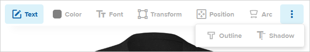
| Name | Default value | Value type | Description |
|---|---|---|---|
--pf-comp-designer-toolbar-surface |
--pf-sys-background |
color, valid RGB, RGBA, HSL, HSLA color values and CSS4 Hex notation | Designer toolbar surface color |
--pf-comp-designer-toolbar-button-new-indicator-on-surface |
--pf-sys-primary-400-on-background |
color, valid RGB, RGBA, HSL, HSLA color values and CSS4 Hex notation | New indicator color on designer toolbar button surface |
--pf-comp-designer-toolbar-button-hover-new-indicator-on-surface |
--pf-comp-designer-toolbar-button-new-indicator-on-surface |
color, valid RGB, RGBA, HSL, HSLA color values and CSS4 Hex notation | New indicator color on hovered designer toolbar button surface |
--pf-comp-designer-toolbar-button-focus-new-indicator-on-surface |
--pf-comp-designer-toolbar-button-new-indicator-on-surface |
color, valid RGB, RGBA, HSL, HSLA color values and CSS4 Hex notation | New indicator color on focused designer toolbar button surface |
--pf-comp-designer-toolbar-button-selected-new-indicator-on-surface |
--pf-comp-designer-toolbar-button-new-indicator-on-surface |
color, valid RGB, RGBA, HSL, HSLA color values and CSS4 Hex notation | New indicator color on selected designer toolbar button surface |
--pf-comp-designer-toolbar-button-disabled-new-indicator-on-surface |
--pf-comp-designer-toolbar-button-new-indicator-on-surface |
color, valid RGB, RGBA, HSL, HSLA color values and CSS4 Hex notation | New indicator color on disabled designer toolbar button surface |
--pf-comp-designer-toolbar-more-button-popover-surface |
--pf-sys-background |
color, valid RGB, RGBA, HSL, HSLA color values and CSS4 Hex notation | Designer toolbar more button popover surface color |
--pf-comp-designer-toolbar-more-button-popover-border-color |
--pf-sys-border-on-background |
color, valid RGB, RGBA, HSL, HSLA color values and CSS4 Hex notation | Designer toolbar more button popover border color on background |
--pf-comp-designer-toolbar-more-button-popover-box-shadow |
--pf-comp-dropdown-input-menu-box-shadow |
valid full box-shadow value |
Designer toolbar more button popover shadow on background |
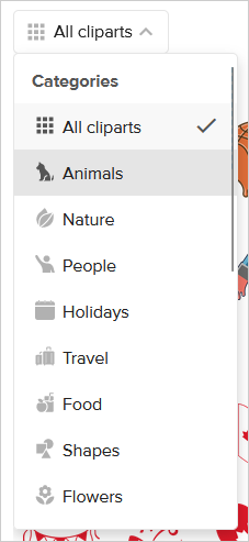
| Name | Default value | Value type | Description |
|---|---|---|---|
--pf-comp-dropdown-input-placeholder-on-surface |
--pf-comp-input-placeholder-on-surface |
color, valid RGB, RGBA, HSL, HSLA color values and CSS4 Hex notation | Placeholder color on dropdown input surface |
--pf-comp-dropdown-input-button-surface |
--pf-sys-background |
color, valid RGB, RGBA, HSL, HSLA color values and CSS4 Hex notation | Dropdown input button surface color |
--pf-comp-dropdown-input-button-on-surface |
--pf-comp-input-on-surface |
color, valid RGB, RGBA, HSL, HSLA color values and CSS4 Hex notation | Color on dropdown input button surface |
--pf-comp-dropdown-input-button-border-color |
--pf-comp-input-border-color |
color, valid RGB, RGBA, HSL, HSLA color values and CSS4 Hex notation | Dropdown input button border color on background |
--pf-comp-dropdown-input-button-icon-on-surface |
--pf-sys-icon-on-background |
color, valid RGB, RGBA, HSL, HSLA color values and CSS4 Hex notation | Icon color on dropdown input button surface |
--pf-comp-dropdown-input-button-search-input-border-color |
--pf-comp-dropdown-input-button-border-color |
color, valid RGB, RGBA, HSL, HSLA color values and CSS4 Hex notation | Dropdown input button search input border color on background |
--pf-comp-dropdown-input-open-button-surface |
--pf-comp-dropdown-input-button-surface |
color, valid RGB, RGBA, HSL, HSLA color values and CSS4 Hex notation | Opened dropdown input button surface color |
--pf-comp-dropdown-input-disabled-button-surface |
--pf-comp-input-disabled-surface |
color, valid RGB, RGBA, HSL, HSLA color values and CSS4 Hex notation | Disabled dropdown input button surface color |
--pf-comp-dropdown-input-disabled-button-on-surface |
--pf-comp-input-disabled-on-surface |
color, valid RGB, RGBA, HSL, HSLA color values and CSS4 Hex notation | Color on disabled dropdown input button surface |
--pf-comp-dropdown-input-dropdown-border-color |
--pf-comp-dropdown-input-button-border-color |
color, valid RGB, RGBA, HSL, HSLA color values and CSS4 Hex notation | Dropdown input dropdown border color on background |
--pf-comp-dropdown-input-menu-box-shadow |
0 3px 8px 0 hsla(0, 0%, 0%, 0.19) |
valid full box-shadow value |
Dropdown input menu shadow on background |
--pf-comp-dropdown-input-menu-up-border-top-color |
hsla(0, 0%, 0%, .15) |
color, valid RGB, RGBA, HSL, HSLA color values and CSS4 Hex notation | Top border color on upward dropdown input menu surface |
--pf-comp-dropdown-input-menu-up-box-shadow |
0 -3px 8px 0 hsla(0, 0%, 0%, 0.19) |
valid full box-shadow value |
Dropdown input up menu shadow on background |
--pf-comp-dropdown-input-menu-list-surface |
--pf-comp-dropdown-input-button-surface |
color, valid RGB, RGBA, HSL, HSLA color values and CSS4 Hex notation | Dropdown input menu list surface color |
--pf-comp-dropdown-input-menu-list-on-surface |
--pf-comp-dropdown-input-button-on-surface |
color, valid RGB, RGBA, HSL, HSLA color values and CSS4 Hex notation | Color on dropdown input menu list surface |
--pf-comp-dropdown-input-menu-group-title-on-surface |
--pf-sys-neutral-700-on-background |
color, valid RGB, RGBA, HSL, HSLA color values and CSS4 Hex notation | Group title color on dropdown input menu surface |
--pf-comp-dropdown-input-menu-item-surface |
--pf-comp-dropdown-input-menu-list-surface |
color, valid RGB, RGBA, HSL, HSLA color values and CSS4 Hex notation | Dropdown input menu item surface color |
--pf-comp-dropdown-input-menu-item-on-surface |
--pf-comp-dropdown-input-menu-list-on-surface |
color, valid RGB, RGBA, HSL, HSLA color values and CSS4 Hex notation | Color on dropdown input menu item surface |
--pf-comp-dropdown-input-menu-item-icon-on-surface |
--pf-sys-icon-on-background |
color, valid RGB, RGBA, HSL, HSLA color values and CSS4 Hex notation | Icon color on dropdown input menu item surface |
--pf-comp-dropdown-input-menu-item-description-on-surface |
--pf-sys-neutral-700-on-background |
color, valid RGB, RGBA, HSL, HSLA color values and CSS4 Hex notation | Description color on dropdown input menu item surface |
--pf-comp-dropdown-input-menu-item-hover-surface |
--pf-sys-neutral-surface-300 |
color, valid RGB, RGBA, HSL, HSLA color values and CSS4 Hex notation | Hovered dropdown input menu item surface color |
--pf-comp-dropdown-input-menu-item-hover-on-surface |
--pf-sys-neutral-900-on-surface-300 |
color, valid RGB, RGBA, HSL, HSLA color values and CSS4 Hex notation | Color on hovered dropdown input menu item surface |
--pf-comp-dropdown-input-menu-item-hover-icon-on-surface |
 --pf-sys-icon-hover-neutral-700-on-background |
color, valid RGB, RGBA, HSL, HSLA color values and CSS4 Hex notation | Icon color on hovered dropdown input menu item surface |
--pf-comp-dropdown-input-menu-item-focus-surface |
--pf-comp-dropdown-input-menu-item-hover-surface |
color, valid RGB, RGBA, HSL, HSLA color values and CSS4 Hex notation | Focused dropdown input menu item surface color |
--pf-comp-dropdown-input-menu-item-focus-on-surface |
--pf-comp-dropdown-input-menu-item-hover-on-surface |
color, valid RGB, RGBA, HSL, HSLA color values and CSS4 Hex notation | Color on focused dropdown input menu item surface |
--pf-comp-dropdown-input-menu-item-selected-surface |
--pf-sys-neutral-surface-50 |
color, valid RGB, RGBA, HSL, HSLA color values and CSS4 Hex notation | Selected dropdown input menu item surface color |
--pf-comp-dropdown-input-menu-item-selected-on-surface |
--pf-sys-neutral-900-on-surface-50 |
color, valid RGB, RGBA, HSL, HSLA color values and CSS4 Hex notation | Color on selected dropdown input menu item surface |
--pf-comp-dropdown-input-menu-item-selected-icon-on-surface |
--pf-sys-icon-hover-neutral-700-on-background |
color, valid RGB, RGBA, HSL, HSLA color values and CSS4 Hex notation | Icon color on selected dropdown input menu item surface |
--pf-comp-dropdown-input-menu-date-surface |
--pf-comp-dropdown-input-button-surface |
color, valid RGB, RGBA, HSL, HSLA color values and CSS4 Hex notation | Dropdown input date menu surface color |
--pf-comp-dropdown-input-menu-date-border-color |
--pf-comp-dropdown-input-menu-up-border-top-color |
color, valid RGB, RGBA, HSL, HSLA color values and CSS4 Hex notation | Border color on dropdown input date menu surface |
--pf-comp-dropdown-input-menu-date-box-shadow |
0 6px 12px hsla(0, 0%, 0%, .175) |
valid full box-shadow value |
Dropdown input date menu shadow on background |
--pf-comp-dropdown-input-tags-border-top-color |
--pf-comp-dropdown-input-button-border-color |
color, valid RGB, RGBA, HSL, HSLA color values and CSS4 Hex notation | Tags top border color on dropdown input surface |
--pf-comp-dropdown-input-close-search-icon-on-surface |
--pf-sys-icon-on-background |
color, valid RGB, RGBA, HSL, HSLA color values and CSS4 Hex notation | Close search icon color on dropdown input surface |
--pf-comp-dropdown-input-close-search-icon-hover-on-surface |
--pf-sys-icon-hover-neutral-700-on-background |
color, valid RGB, RGBA, HSL, HSLA color values and CSS4 Hex notation | Hovered close search icon color on dropdown input surface |
Used for interactive form elements - checkbox, radio button, toggle switch
| Name | Default value | Value type | Description |
|---|---|---|---|
--pf-comp-form-control-indicator-surface |
--pf-comp-input-surface |
color, valid RGB, RGBA, HSL, HSLA color values and CSS4 Hex notation | Form control indicator surface color |
--pf-comp-form-control-indicator-border-color |
--pf-sys-neutral-400-on-background |
color, valid RGB, RGBA, HSL, HSLA color values and CSS4 Hex notation | Form control indicator border color on background |
--pf-comp-form-control-checked-indicator-surface |
--pf-sys-form-control-indicator-active-surface |
color, valid RGB, RGBA, HSL, HSLA color values and CSS4 Hex notation | Checked form control indicator surface color |
--pf-comp-form-control-checked-indicator-on-surface |
--pf-sys-form-control-indicator-active-on-surface |
color, valid RGB, RGBA, HSL, HSLA color values and CSS4 Hex notation | Color on checked form control indicator surface |
--pf-comp-form-control-checked-indicator-border-color |
--pf-comp-form-control-checked-indicator-surface |
color, valid RGB, RGBA, HSL, HSLA color values and CSS4 Hex notation | Checked form control indicator border color on background |
--pf-comp-form-control-checked-disabled-indicator-surface |
hsla(207.24, 81.72%, 36.47%, 0.5) |
color, valid RGB, RGBA, HSL, HSLA color values and CSS4 Hex notation | Checked disabled form control indicator surface color |
--pf-comp-form-control-active-indicator-surface |
lighten(hsl(207.24, 81.72%, 36.47%), 35%) |
color, valid RGB, RGBA, HSL, HSLA color values and CSS4 Hex notation | Activated (pressed) form control indicator surface color |
--pf-comp-form-control-active-indicator-on-surface |
--pf-comp-form-control-checked-indicator-on-surface |
color, valid RGB, RGBA, HSL, HSLA color values and CSS4 Hex notation | Color on activated (pressed) form control indicator surface |
--pf-comp-form-control-active-indicator-border-color |
--pf-comp-form-control-checked-indicator-surface |
color, valid RGB, RGBA, HSL, HSLA color values and CSS4 Hex notation | Activated (pressed) form control indicator border color on background |
--pf-comp-form-control-disabled-indicator-surface |
--pf-comp-form-control-indicator-surface |
color, valid RGB, RGBA, HSL, HSLA color values and CSS4 Hex notation | Disabled form control indicator surface color |
--pf-comp-form-control-disabled-indicator-border-color |
--pf-comp-input-border-color |
color, valid RGB, RGBA, HSL, HSLA color values and CSS4 Hex notation | Color on disabled form control indicator surface |
--pf-comp-form-control-disabled-label-on-surface |
--pf-comp-input-disabled-on-surface |
color, valid RGB, RGBA, HSL, HSLA color values and CSS4 Hex notation | Disabled form control label color on background |
--pf-comp-form-control-hover-indicator-box-shadow |
inset 0 0 0 3px --pf-comp-input-border-color |
valid full box-shadow value |
Hovered form control inside border color on form control indicator surface |
--pf-comp-form-control-not-unchecked-hover-indicator-box-shadow |
inset 0 0 0 0 --pf-comp-input-border-color |
valid full box-shadow value |
Checked, indeterminate hovered form control inside border color on form control indicator surface |
--pf-comp-form-control-error-indicator-border-color |
--pf-comp-input-error-border-color |
color, valid RGB, RGBA, HSL, HSLA color values and CSS4 Hex notation | Errored form control indicator border color on background |
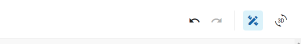
| Name | Default value | Value type | Description |
|---|---|---|---|
--pf-comp-header-surface |
--pf-sys-background |
color, valid RGB, RGBA, HSL, HSLA color values and CSS4 Hex notation | Header surface color |
--pf-comp-header-vertical-divider |
--pf-sys-border-on-background |
color, valid RGB, RGBA, HSL, HSLA color values and CSS4 Hex notation | Header vertical divider color. Separates header from main design area |
--pf-comp-header-horizontal-divider |
--pf-sys-border-on-background |
color, valid RGB, RGBA, HSL, HSLA color values and CSS4 Hex notation | Header horizontal divider color. Separates grouped buttons |
| Name | Default value | Value type | Description |
|---|---|---|---|
--pf-comp-input-placeholder-on-surface |
--pf-sys-neutral-700-on-background |
color, valid RGB, RGBA, HSL, HSLA color values and CSS4 Hex notation | Placeholder color on input surface |
--pf-comp-input-surface |
--pf-sys-background |
color, valid RGB, RGBA, HSL, HSLA color values and CSS4 Hex notation | Input surface color |
--pf-comp-input-on-surface |
--pf-sys-neutral-900-on-background |
color, valid RGB, RGBA, HSL, HSLA color values and CSS4 Hex notation | Color on input surface |
--pf-comp-input-border-color |
--pf-sys-border-on-background |
color, valid RGB, RGBA, HSL, HSLA color values and CSS4 Hex notation | Input border color on background |
--pf-comp-input-inset-box-shadow |
inset 0 1px 1px hsla(0, 0%, 0%, 0.075) |
valid full box-shadow value |
Inner shadow on input surface |
--pf-comp-input-outline |
none |
valid full outline value |
Input outline |
--pf-comp-input-focus-surface |
--pf-comp-input-surface |
color, valid RGB, RGBA, HSL, HSLA color values and CSS4 Hex notation | Focused input surface color |
--pf-comp-input-focus-on-surface |
--pf-comp-input-on-surface |
color, valid RGB, RGBA, HSL, HSLA color values and CSS4 Hex notation | Color on focused input surface |
--pf-comp-input-focus-border-color |
--pf-sys-neutral-400-on-background |
color, valid RGB, RGBA, HSL, HSLA color values and CSS4 Hex notation | Focused input border color on background |
--pf-comp-input-focus-box-shadow |
0 2px 4px 0 hsla(0, 0%, 0%, 0.25) |
valid full box-shadow value |
Focused input shadow on background |
--pf-comp-input-focus-outline |
none |
valid full outline value |
Focused input outline |
--pf-comp-input-disabled-surface |
--pf-sys-neutral-surface-50 |
color, valid RGB, RGBA, HSL, HSLA color values and CSS4 Hex notation | Disabled input surface |
--pf-comp-input-disabled-on-surface |
--pf-sys-neutral-700-on-surface-50 |
color, valid RGB, RGBA, HSL, HSLA color values and CSS4 Hex notation | Color on disabled input surface |
--pf-comp-input-disabled-focus-border-color |
--pf-comp-input-border-color |
color, valid RGB, RGBA, HSL, HSLA color values and CSS4 Hex notation | Disabled focused input border color on background |
--pf-comp-input-disabled-focus-box-shadow |
none |
valid full box-shadow value |
Disabled focused input shadow on background |
--pf-comp-input-plaintext-surface |
transparent |
color, valid RGB, RGBA, HSL, HSLA color values and CSS4 Hex notation | Plaintext input surface color |
--pf-comp-input-plaintext-on-surface |
--pf-comp-input-on-surface |
color, valid RGB, RGBA, HSL, HSLA color values and CSS4 Hex notation | Color on plaintext input surface |
--pf-comp-input-plaintext-border-color |
--pf-comp-input-plaintext-surface |
color, valid RGB, RGBA, HSL, HSLA color values and CSS4 Hex notation | Plaintext input border color on background |
--pf-comp-input-error-border-color |
--pf-comp-input-error-message-on-surface |
color, valid RGB, RGBA, HSL, HSLA color values and CSS4 Hex notation | Errored input border color on background |
--pf-comp-input-error-message-on-surface |
--pf-sys-error-on-background |
color, valid RGB, RGBA, HSL, HSLA color values and CSS4 Hex notation | Errored input message color on background |
--pf-comp-input-clear-button-icon-on-surface |
--pf-sys-icon-on-background |
color, valid RGB, RGBA, HSL, HSLA color values and CSS4 Hex notation | Clear icon color on input surface |
--pf-comp-input-clear-button-icon-hover-on-surface |
--pf-sys-icon-hover-neutral-700-on-background |
color, valid RGB, RGBA, HSL, HSLA color values and CSS4 Hex notation | Hovered clear icon color on input surface |
| Name | Default value | Value type | Description |
|---|---|---|---|
--pf-comp-input-group-inc-dec-button-surface |
--pf-comp-input-surface |
color, valid RGB, RGBA, HSL, HSLA color values and CSS4 Hex notation | Input group increment and decrement button surface color |
--pf-comp-input-group-inc-dec-button-on-surface |
--pf-sys-icon-on-background |
color, valid RGB, RGBA, HSL, HSLA color values and CSS4 Hex notation | Color on input group increment and decrement button surface |
--pf-comp-input-group-inc-dec-button-border-color |
--pf-comp-input-border-color |
color, valid RGB, RGBA, HSL, HSLA color values and CSS4 Hex notation | Input group increment and decrement button border color on background |
--pf-comp-input-group-inc-dec-button-box-shadow |
0 2px 4px 0 hsla(0, 0%, 0%, 0.25) |
valid full box-shadow value |
Focused input group increment and decrement button shadow on background |
| Name | Default value | Value type | Description |
|---|---|---|---|
--pf-comp-layer-item-surface |
--pf-sys-background |
color, valid RGB, RGBA, HSL, HSLA color values and CSS4 Hex notation | Layer item surface color |
--pf-comp-layer-item-on-surface |
--pf-sys-neutral-900-on-background |
color, valid RGB, RGBA, HSL, HSLA color values and CSS4 Hex notation | Color on layer item surface |
--pf-comp-layer-item-border-color |
transparent |
color, valid RGB, RGBA, HSL, HSLA color values and CSS4 Hex notation | Layer item border color on background |
--pf-comp-layer-item-hover-border-color |
--pf-sys-neutral-400-on-background |
color, valid RGB, RGBA, HSL, HSLA color values and CSS4 Hex notation | Hovered layer item border color on background |
--pf-comp-layer-item-selected-surface |
--pf-sys-neutral-surface-50 |
color, valid RGB, RGBA, HSL, HSLA color values and CSS4 Hex notation | Selected layer item surface color |
--pf-comp-layer-item-control-hover-surface |
--pf-sys-neutral-surface-50 |
color, valid RGB, RGBA, HSL, HSLA color values and CSS4 Hex notation | Hovered control button surface color on layer item surface |
--pf-comp-layer-item-control-hover-on-surface |
--pf-sys-neutral-900-on-surface-50 |
color, valid RGB, RGBA, HSL, HSLA color values and CSS4 Hex notation | Color on hovered control button surface |
--pf-comp-layer-item-selected-control-hover-surface |
--pf-sys-neutral-surface-300 |
color, valid RGB, RGBA, HSL, HSLA color values and CSS4 Hex notation | Hovered control button surface color on selected layer item surface |
--pf-comp-layer-item-selected-control-hover-on-surface |
--pf-sys-neutral-900-on-surface-300 |
color, valid RGB, RGBA, HSL, HSLA color values and CSS4 Hex notation | Color on selected hovered control button surface |
--pf-comp-layer-item-delete-button-surface |
hsl(1.38, 91.6%, 46.67%) |
color, valid RGB, RGBA, HSL, HSLA color values and CSS4 Hex notation | Delete button surface color. Can be seen on mobile when swiping layer item |
--pf-comp-layer-item-delete-button-on-surface |
hsl(0, 0%, 100%) |
color, valid RGB, RGBA, HSL, HSLA color values and CSS4 Hex notation | Color on delete button surface. Can be seen on mobile when swiping layer item |
--pf-comp-layer-item-personalization-indicator-surface |
 hsl(177.45, 78.2%, 41.37%) |
color, valid RGB, RGBA, HSL, HSLA color values and CSS4 Hex notation | Personalization indicator surface color on layer item surface |
--pf-comp-layer-item-personalization-indicator-on-surface |
 hsl(0, 0%, 100%) |
color, valid RGB, RGBA, HSL, HSLA color values and CSS4 Hex notation | Color on personalization indicator surface |
--pf-comp-layer-item-adjusted-badge-surface |
 hsl(24, 8.93%, 21.96%) |
color, valid RGB, RGBA, HSL, HSLA color values and CSS4 Hex notation | Adjusted badge surface color on layer item surface |
--pf-comp-layer-item-adjusted-badge-on-surface |
 hsl(0, 0%, 100%) |
color, valid RGB, RGBA, HSL, HSLA color values and CSS4 Hex notation | Color on adjusted badge surface |
--pf-comp-layer-item-transparency-info-on-surface |
hsl(43.97, 100%, 48.43%) |
color, valid RGB, RGBA, HSL, HSLA color values and CSS4 Hex notation | Transparency info color on layer item surface |
--pf-comp-layer-item-icon-info-on-surface |
--pf-sys-icon-info-on-background |
color, valid RGB, RGBA, HSL, HSLA color values and CSS4 Hex notation | Info icon (used for tooltips) color on layer item surface |
--pf-comp-layer-group-surface |
--pf-comp-layer-item-surface |
color, valid RGB, RGBA, HSL, HSLA color values and CSS4 Hex notation | Layer group surface color |
--pf-comp-layer-group-border-color |
--pf-comp-layer-item-border-color |
color, valid RGB, RGBA, HSL, HSLA color values and CSS4 Hex notation | Layer group border color on background |
--pf-comp-layer-group-selected-layer-parent-surface |
--pf-comp-layer-item-selected-surface |
color, valid RGB, RGBA, HSL, HSLA color values and CSS4 Hex notation | Selected layer group parent item surface color |
--pf-comp-layer-parent-border-color |
--pf-comp-layer-item-border-color |
color, valid RGB, RGBA, HSL, HSLA color values and CSS4 Hex notation | Layer group parent layer border color on background |
--pf-comp-layer-parent-hover-border-color |
--pf-comp-layer-item-hover-border-color |
color, valid RGB, RGBA, HSL, HSLA color values and CSS4 Hex notation | Hovered layer group parent layer border color on background |


| Name | Default value | Value type | Description |
|---|---|---|---|
--pf-comp-mobile-footer-surface |
--pf-sys-background |
color, valid RGB, RGBA, HSL, HSLA color values and CSS4 Hex notation | Mobile footer surface color |
--pf-comp-mobile-footer-border-color |
--pf-sys-border-on-background |
color, valid RGB, RGBA, HSL, HSLA color values and CSS4 Hex notation | Mobile footer border color |
--pf-comp-mobile-footer-vertical-divider |
--pf-sys-border-on-background |
color, valid RGB, RGBA, HSL, HSLA color values and CSS4 Hex notation | Mobile footer vertical divider. Separates grouped buttons |
--pf-comp-mobile-footer-handle-on-surface |
--pf-sys-neutral-400-on-background |
color, valid RGB, RGBA, HSL, HSLA color values and CSS4 Hex notation | Mobile footer handle color on background |
| Name | Default value | Value type | Description |
|---|---|---|---|
--pf-comp-mobile-header-surface |
--pf-sys-background |
color, valid RGB, RGBA, HSL, HSLA color values and CSS4 Hex notation | Mobile header surface color |
--pf-comp-mobile-header-on-surface |
--pf-sys-neutral-900-on-background |
color, valid RGB, RGBA, HSL, HSLA color values and CSS4 Hex notation | Color on mobile header |
--pf-comp-mobile-header-horizontal-divider |
--pf-sys-border-on-background |
color, valid RGB, RGBA, HSL, HSLA color values and CSS4 Hex notation | Mobile header horizontal divider color. Separates mobile header from main design area |
| Name | Default value | Value type | Description |
|---|---|---|---|
--pf-comp-modal-surface |
--pf-sys-background |
color, valid RGB, RGBA, HSL, HSLA color values and CSS4 Hex notation | Modal surface color |
--pf-comp-modal-on-surface |
--pf-sys-neutral-900-on-background |
color, valid RGB, RGBA, HSL, HSLA color values and CSS4 Hex notation | Color on modal surface |
--pf-comp-modal-divider-on-surface |
--pf-sys-border-on-background |
color, valid RGB, RGBA, HSL, HSLA color values and CSS4 Hex notation | Divider line color on modal surface |
--pf-comp-modal-close-icon-on-surface |
--pf-sys-icon-on-background |
color, valid RGB, RGBA, HSL, HSLA color values and CSS4 Hex notation | Close icon color on modal surface |
--pf-comp-modal-close-icon-hover-on-surface |
--pf-sys-icon-hover-neutral-700-on-background |
color, valid RGB, RGBA, HSL, HSLA color values and CSS4 Hex notation | Hovered close icon color on modal surface |
| Name | Default value | Value type | Description |
|---|---|---|---|
--pf-comp-overlay-surface |
hsla(--pf-sys-background-hsl, 0.5) |
color, valid RGB, RGBA, HSL, HSLA color values and CSS4 Hex notation | Overlay color (meant to have color value with opacity) |
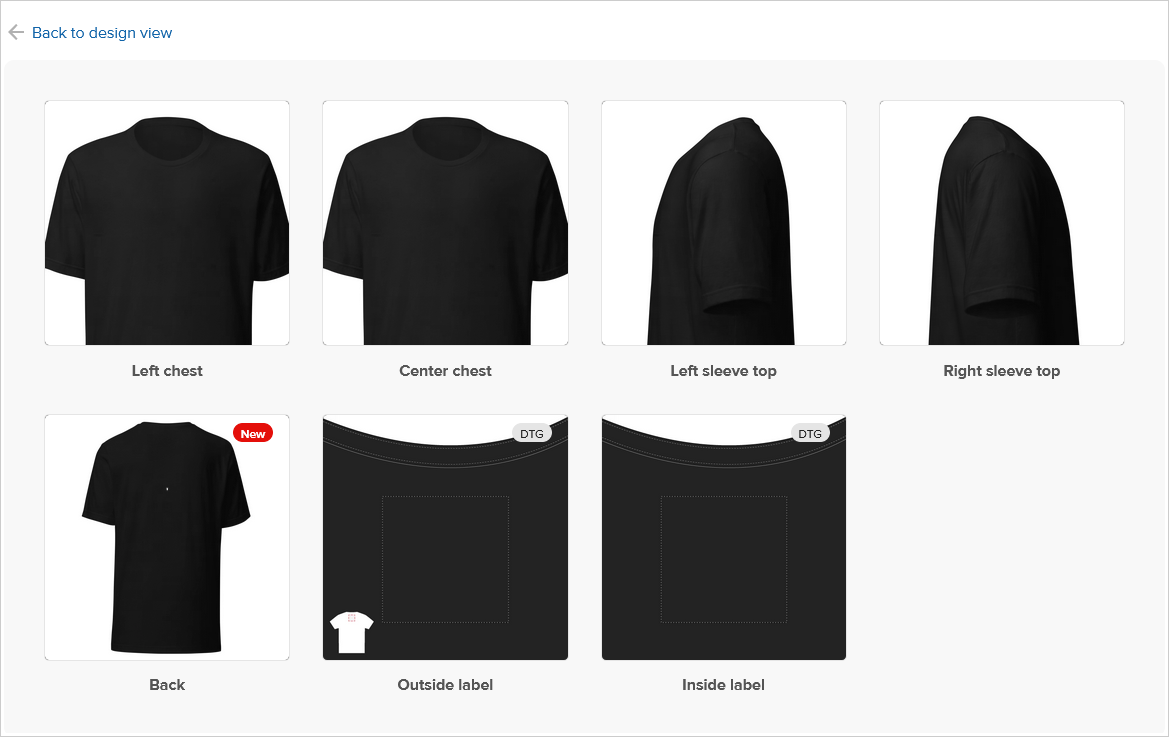
| Name | Default value | Value type | Description |
|---|---|---|---|
--pf-comp-placement-grid-surface |
--pf-sys-neutral-surface-50 |
color, valid RGB, RGBA, HSL, HSLA color values and CSS4 Hex notation | Placement grid surface color |
--pf-comp-placement-grid-on-surface |
--pf-sys-neutral-900-on-surface-50 |
color, valid RGB, RGBA, HSL, HSLA color values and CSS4 Hex notation | Color on placement grid surface |
--pf-comp-placement-grid-card-thumbnail-border-color |
--pf-sys-neutral-300-on-surface-50 |
color, valid RGB, RGBA, HSL, HSLA color values and CSS4 Hex notation | Card thumbnail border color on placement grid surface |
--pf-comp-placement-grid-card-hover-thumbnail-box-shadow |
0 1px 5px rgba(90, 90, 90, 0.5) |
valid full box-shadow value |
Hovered card thumbnail shadow on placement grid surface |
--pf-comp-placement-grid-card-title-on-surface |
--pf-sys-neutral-700-on-surface-50 |
color, valid RGB, RGBA, HSL, HSLA color values and CSS4 Hex notation | Card title color on placement grid surface |
--pf-comp-placement-grid-card-hover-title-on-surface |
--pf-sys-neutral-900-on-surface-50 |
color, valid RGB, RGBA, HSL, HSLA color values and CSS4 Hex notation | Hovered card title color on placement grid surface |
--pf-comp-placement-grid-card-disabled-title-on-surface |
--pf-sys-neutral-400-on-surface-50 |
color, valid RGB, RGBA, HSL, HSLA color values and CSS4 Hex notation | Disabled card title color on placement grid surface |

| Name | Default value | Value type | Description |
|---|---|---|---|
--pf-comp-placement-tab-badge-default-surface |
--pf-comp-badge-default-surface |
color, valid RGB, RGBA, HSL, HSLA color values and CSS4 Hex notation | Default badge surface on placement tab surface |
--pf-comp-placement-tab-badge-default-on-surface |
--pf-comp-badge-default-on-surface |
color, valid RGB, RGBA, HSL, HSLA color values and CSS4 Hex notation | Color on default badge surface on placement tab surface |
--pf-comp-placement-tab-badge-primary-surface |
--pf-comp-badge-primary-surface |
color, valid RGB, RGBA, HSL, HSLA color values and CSS4 Hex notation | Primary badge surface on placement tab surface |
--pf-comp-placement-tab-badge-primary-on-surface |
--pf-comp-badge-primary-on-surface |
color, valid RGB, RGBA, HSL, HSLA color values and CSS4 Hex notation | Color on primary badge surface on placement tab surface |
--pf-comp-placement-tab-badge-beta-surface |
--pf-comp-badge-beta-surface |
color, valid RGB, RGBA, HSL, HSLA color values and CSS4 Hex notation | Beta badge surface on placement tab surface |
--pf-comp-placement-tab-badge-beta-on-surface |
--pf-comp-badge-beta-on-surface |
color, valid RGB, RGBA, HSL, HSLA color values and CSS4 Hex notation | Color on beta badge surface on placement tab surface |
--pf-comp-placement-tab-hover-badge-default-surface |
--pf-sys-neutral-surface-400 |
color, valid RGB, RGBA, HSL, HSLA color values and CSS4 Hex notation | Default badge surface on hovered placement tab surface |
--pf-comp-placement-tab-hover-badge-default-on-surface |
--pf-sys-neutral-900-on-surface-400 |
color, valid RGB, RGBA, HSL, HSLA color values and CSS4 Hex notation | Color on default badge surface on hovered placement tab surface |
--pf-comp-placement-tab-hover-badge-primary-surface |
--pf-comp-placement-tab-badge-primary-surface |
color, valid RGB, RGBA, HSL, HSLA color values and CSS4 Hex notation | Primary badge surface on hovered placement tab surface |
--pf-comp-placement-tab-hover-badge-primary-on-surface |
--pf-comp-placement-tab-badge-primary-on-surface |
color, valid RGB, RGBA, HSL, HSLA color values and CSS4 Hex notation | Color on primary badge surface on hovered placement tab surface |
--pf-comp-placement-tab-hover-badge-beta-surface |
--pf-comp-placement-tab-badge-beta-surface |
color, valid RGB, RGBA, HSL, HSLA color values and CSS4 Hex notation | Beta badge surface on hovered placement tab surface |
--pf-comp-placement-tab-hover-badge-beta-on-surface |
--pf-comp-placement-tab-badge-beta-on-surface |
color, valid RGB, RGBA, HSL, HSLA color values and CSS4 Hex notation | Color on beta badge surface on hovered placement tab surface |
--pf-comp-placement-tab-selected-badge-default-surface |
 hsl(194.4, 53.19%, 81.57%) |
color, valid RGB, RGBA, HSL, HSLA color values and CSS4 Hex notation | Default badge surface on selected placement tab surface |
--pf-comp-placement-tab-selected-badge-default-on-surface |
 hsl(207.24, 81.72%, 36.47%) |
color, valid RGB, RGBA, HSL, HSLA color values and CSS4 Hex notation | Color on default badge surface on selected placement tab surface |
--pf-comp-placement-tab-selected-badge-primary-surface |
--pf-comp-placement-tab-badge-primary-surface |
color, valid RGB, RGBA, HSL, HSLA color values and CSS4 Hex notation | Primary badge surface on selected placement tab surface |
--pf-comp-placement-tab-selected-badge-primary-on-surface |
--pf-comp-placement-tab-badge-primary-on-surface |
color, valid RGB, RGBA, HSL, HSLA color values and CSS4 Hex notation | Color on primary badge surface on selected placement tab surface |
--pf-comp-placement-tab-selected-badge-beta-surface |
--pf-comp-placement-tab-badge-beta-surface |
color, valid RGB, RGBA, HSL, HSLA color values and CSS4 Hex notation | Beta badge surface on selected placement tab surface |
--pf-comp-placement-tab-selected-badge-beta-on-surface |
--pf-comp-placement-tab-badge-beta-on-surface |
color, valid RGB, RGBA, HSL, HSLA color values and CSS4 Hex notation | Color on beta badge surface on selected placement tab surface |
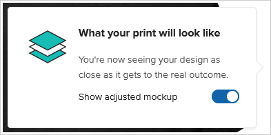
| Name | Default value | Value type | Description |
|---|---|---|---|
--pf-comp-popover-surface |
--pf-sys-background |
color, valid RGB, RGBA, HSL, HSLA color values and CSS4 Hex notation | Popover surface color |
--pf-comp-popover-on-surface |
--pf-sys-neutral-900-on-background |
color, valid RGB, RGBA, HSL, HSLA color values and CSS4 Hex notation | Color on popover surface |
--pf-comp-popover-subdued-on-surface |
--pf-sys-neutral-700-on-background |
color, valid RGB, RGBA, HSL, HSLA color values and CSS4 Hex notation | Subdued color on popover surface |
--pf-comp-popover-border-color |
--pf-sys-border-on-background |
color, valid RGB, RGBA, HSL, HSLA color values and CSS4 Hex notation | Popover border color on background |
--pf-comp-popover-box-shadow |
0 2px 4px 0 hsla(0, 0%, 0%, 0.07) |
valid full box-shadow value |
Popover shadow on background |
--pf-comp-popover-close-icon-on-surface |
--pf-sys-icon-on-background |
color, valid RGB, RGBA, HSL, HSLA color values and CSS4 Hex notation | Close icon color on popover surface |
--pf-comp-popover-close-icon-hover-on-surface |
--pf-sys-icon-hover-neutral-700-on-background |
color, valid RGB, RGBA, HSL, HSLA color values and CSS4 Hex notation | Hovered close icon color on popover surface |
| Name | Default value | Value type | Description |
|---|---|---|---|
--pf-comp-radio-checked-indicator-surface |
--pf-comp-form-control-checked-indicator-surface |
color, valid RGB, RGBA, HSL, HSLA color values and CSS4 Hex notation | Checked radio indicator surface color |
--pf-comp-radio-checked-indicator-on-surface |
--pf-sys-form-control-indicator-active-on-surface |
color, valid RGB, RGBA, HSL, HSLA color values and CSS4 Hex notation | Color on checked radio indicator surface |
--pf-comp-radio-checked-disabled-indicator-surface |
--pf-comp-form-control-checked-disabled-indicator-surface |
color, valid RGB, RGBA, HSL, HSLA color values and CSS4 Hex notation | Checked disabled radio indicator surface color |
--pf-comp-radio-not-unchecked-hover-indicator-box-shadow |
--pf-comp-form-control-not-unchecked-hover-indicator-box-shadow |
valid full box-shadow value |
Disabled, checked, hovered radio inside border color on radio indicator surface |
| Name | Default value | Value type | Description |
|---|---|---|---|
--pf-comp-range-slider-track-surface |
--pf-sys-neutral-300-on-background |
color, valid RGB, RGBA, HSL, HSLA color values and CSS4 Hex notation | Range slider track surface color |
--pf-comp-range-slider-focus-track-surface |
rgba(13, 13, 13, 0.2) |
color, valid RGB, RGBA, HSL, HSLA color values and CSS4 Hex notation | Focused range slider track surface color |
--pf-comp-range-slider-thumb-surface |
--pf-sys-background |
color, valid RGB, RGBA, HSL, HSLA color values and CSS4 Hex notation | Range slider thumb surface color |
--pf-comp-range-slider-thumb-border-color |
 #CCCCCC |
color, valid RGB, RGBA, HSL, HSLA color values and CSS4 Hex notation | Range slider thumb border color on background |
--pf-comp-range-slider-thumb-box-shadow |
0 2px 4px 0 hsla(0, 0%, 0%, 0.07) |
valid full box-shadow value |
Range slider thumb shadow on background |
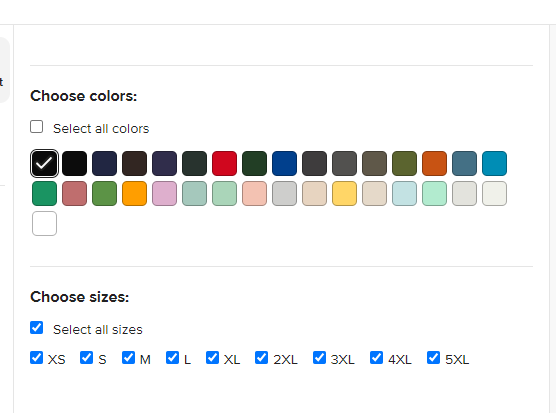
| Name | Default value | Value type | Description |
|---|---|---|---|
--pf-comp-sidebar-content-surface |
--pf-sys-background |
color, valid RGB, RGBA, HSL, HSLA color values and CSS4 Hex notation | Sidebar content surface color |
--pf-comp-sidebar-content-vertical-divider |
--pf-sys-border-on-background |
color, valid RGB, RGBA, HSL, HSLA color values and CSS4 Hex notation | Sidebar content vertical divider color. Separates sidebar content from main design area |

| Name | Default value | Value type | Description |
|---|---|---|---|
--pf-comp-sidebar-navigation-surface |
--pf-sys-background |
color, valid RGB, RGBA, HSL, HSLA color values and CSS4 Hex notation | Sidebar navigation surface color |
--pf-comp-sidebar-navigation-horizontal-divider |
--pf-sys-border-on-background |
color, valid RGB, RGBA, HSL, HSLA color values and CSS4 Hex notation | Sidebar navigation horizontal divider color |
--pf-comp-sidebar-navigation-vertical-divider |
--pf-sys-border-on-background |
color, valid RGB, RGBA, HSL, HSLA color values and CSS4 Hex notation | Sidebar navigation vertical divider color |
--pf-comp-sidebar-navigation-item-border-radius |
--pf-sys-border-radius-lg |
border radius, valid one, two, three, or four |
Sidebar navigation item border radius |
--pf-comp-sidebar-navigation-item-surface |
--pf-sys-background |
color, valid RGB, RGBA, HSL, HSLA color values and CSS4 Hex notation | Sidebar navigation item surface color |
--pf-comp-sidebar-navigation-item-on-surface |
--pf-sys-neutral-700-on-background |
color, valid RGB, RGBA, HSL, HSLA color values and CSS4 Hex notation | Color on sidebar navigation item |
--pf-comp-sidebar-navigation-item-hover-surface |
--pf-sys-neutral-surface-100 |
color, valid RGB, RGBA, HSL, HSLA color values and CSS4 Hex notation | Sidebar navigation hovered item surface color |
--pf-comp-sidebar-navigation-item-hover-on-surface |
--pf-sys-neutral-700-on-background |
color, valid RGB, RGBA, HSL, HSLA color values and CSS4 Hex notation | Color on hovered sidebar navigation item |
--pf-comp-sidebar-navigation-item-focus-surface |
--pf-sys-neutral-surface-100 |
color, valid RGB, RGBA, HSL, HSLA color values and CSS4 Hex notation | Sidebar navigation focused item surface color |
--pf-comp-sidebar-navigation-item-focus-on-surface |
--pf-sys-neutral-700-on-background |
color, valid RGB, RGBA, HSL, HSLA color values and CSS4 Hex notation | color on focused sidebar navigation item |
--pf-comp-sidebar-navigation-item-selected-surface |
--pf-sys-neutral-surface-100 |
color, valid RGB, RGBA, HSL, HSLA color values and CSS4 Hex notation | Sidebar navigation selected item surface color |
--pf-comp-sidebar-navigation-item-selected-on-surface |
--pf-sys-neutral-900-on-background |
color, valid RGB, RGBA, HSL, HSLA color values and CSS4 Hex notation | Color on selected sidebar navigation item |
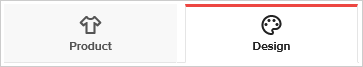


| Name | Default value | Value type | Description |
|---|---|---|---|
--pf-comp-tab-container-nav-arrow-surface |
--pf-sys-background |
color, valid RGB, RGBA, HSL, HSLA color values and CSS4 Hex notation | Tab container navigation arrow surface color |
--pf-comp-tab-container-nav-arrow-on-surface |
--pf-sys-icon-on-background |
color, valid RGB, RGBA, HSL, HSLA color values and CSS4 Hex notation | Color on tab container navigation arrow surface |
--pf-comp-tab-container-nav-arrow-hover-on-surface |
--pf-sys-icon-hover-neutral-700-on-background |
color, valid RGB, RGBA, HSL, HSLA color values and CSS4 Hex notation | Color on hovered tab container navigation arrow surface |
--pf-comp-tab-on-surface |
--pf-sys-neutral-700-on-background |
color, valid RGB, RGBA, HSL, HSLA color values and CSS4 Hex notation | Tab surface color |
--pf-comp-tab-border-color |
transparent |
color, valid RGB, RGBA, HSL, HSLA color values and CSS4 Hex notation | Tab border color on background |
--pf-comp-tab-active-on-surface |
--pf-sys-neutral-900-on-background |
color, valid RGB, RGBA, HSL, HSLA color values and CSS4 Hex notation | Active tab surface color |
--pf-comp-tab-subtitle-on-surface |
--pf-comp-tab-on-surface |
color, valid RGB, RGBA, HSL, HSLA color values and CSS4 Hex notation | Subtitle color on tab surface |
--pf-comp-tab-mobile-surface |
--pf-sys-background |
color, valid RGB, RGBA, HSL, HSLA color values and CSS4 Hex notation | Mobile tab surface color |
--pf-comp-tab-mobile-border-color |
--pf-sys-border-on-background |
color, valid RGB, RGBA, HSL, HSLA color values and CSS4 Hex notation | Mobile tab border color on background |
--pf-comp-tab-mobile-active-surface |
--pf-comp-tab-mobile-surface |
color, valid RGB, RGBA, HSL, HSLA color values and CSS4 Hex notation | Active mobile tab surface color |
--pf-comp-tab-mobile-active-border-color |
--pf-comp-tab-mobile-border-color |
color, valid RGB, RGBA, HSL, HSLA color values and CSS4 Hex notation | Active mobile tab border color on background |
--pf-comp-tab-mobile-active-box-shadow |
none |
valid full box-shadow value |
Active mobile tab shadow on background |
--pf-comp-tab-primary-container-box-shadow |
inset 0 -1px 0px 0px --pf-comp-tab-primary-border-bottom-color |
valid full box-shadow value |
Bottom connector line color between primary tabs |
--pf-comp-tab-primary-surface |
--pf-sys-neutral-surface-50 |
color, valid RGB, RGBA, HSL, HSLA color values and CSS4 Hex notation | Primary tab surface color |
--pf-comp-tab-primary-border-color |
 --pf-comp-tab-primary-surface |
color, valid RGB, RGBA, HSL, HSLA color values and CSS4 Hex notation | Primary tab border color on background |
--pf-comp-tab-primary-border-bottom-color |
--pf-sys-border-on-background |
color, valid RGB, RGBA, HSL, HSLA color values and CSS4 Hex notation | Primary tab bottom border color on background |
--pf-comp-tab-primary-active-surface |
--pf-sys-background |
color, valid RGB, RGBA, HSL, HSLA color values and CSS4 Hex notation | Active primary tab surface color |
--pf-comp-tab-primary-active-border-color |
--pf-comp-tab-primary-border-bottom-color |
color, valid RGB, RGBA, HSL, HSLA color values and CSS4 Hex notation | Active primary tab border color on background |
--pf-comp-tab-primary-active-border-top-color |
--pf-sys-primary-400-on-background |
color, valid RGB, RGBA, HSL, HSLA color values and CSS4 Hex notation | Active primary tab top border color on background (colorful accent) |
--pf-comp-tab-primary-active-border-bottom-color |
--pf-comp-tab-primary-active-surface |
color, valid RGB, RGBA, HSL, HSLA color values and CSS4 Hex notation | Active primary tab bottom border color on background |
--pf-comp-tab-primary-subtitle-on-surface |
--pf-comp-tab-subtitle-on-surface |
color, valid RGB, RGBA, HSL, HSLA color values and CSS4 Hex notation | Primary tab subtitle color on surface |
--pf-comp-tab-primary-subtitle-desktop-surface |
transparent |
color, valid RGB, RGBA, HSL, HSLA color values and CSS4 Hex notation | Desktop primary tab with subtitle color on surface |
--pf-comp-tab-primary-subtitle-desktop-border-color |
--pf-comp-tab-primary-subtitle-desktop-surface |
color, valid RGB, RGBA, HSL, HSLA color values and CSS4 Hex notation | Desktop primary tab with subtitle border color on background |
--pf-comp-tab-primary-subtitle-desktop-active-border-color |
--pf-comp-tab-primary-subtitle-desktop-surface |
color, valid RGB, RGBA, HSL, HSLA color values and CSS4 Hex notation | Active desktop primary tab with subtitle border color on background |
--pf-comp-tab-primary-subtitle-desktop-active-box-shadow |
inset 0 -3px 0 --pf-comp-tab-primary-active-border-top-color |
valid full box-shadow value |
Active desktop primary tab with subtitle bottom border color on background (colorful accent) |
--pf-comp-tab-secondary-container-box-shadow |
inset 0 -1px 0px 0px --pf-sys-border-on-background |
valid full box-shadow value |
Secondary tab container bottom border color on background |
--pf-comp-tab-secondary-active-box-shadow |
inset 0 -3px --pf-sys-neutral-900-on-background |
valid full box-shadow value |
Active secondary tab bottom border color on background |
--pf-comp-tab-secondary-subtitle-on-surface |
--pf-comp-tab-subtitle-on-surface |
color, valid RGB, RGBA, HSL, HSLA color values and CSS4 Hex notation | Subtitle color on secondary tab surface |
--pf-comp-tab-designer-mobile-surface |
--pf-comp-tab-primary-surface |
color, valid RGB, RGBA, HSL, HSLA color values and CSS4 Hex notation | Mobile designer tab surface color |
--pf-comp-tab-designer-mobile-border-color |
--pf-comp-tab-border-color |
color, valid RGB, RGBA, HSL, HSLA color values and CSS4 Hex notation | Mobile designer tab border color on background |
| Name | Default value | Value type | Description |
|---|---|---|---|
--pf-comp-toggle-switch-surface |
--pf-sys-neutral-surface-400 |
color, valid RGB, RGBA, HSL, HSLA color values and CSS4 Hex notation | Toggle switch surface color |
--pf-comp-toggle-switch-border-color |
--pf-sys-neutral-400-on-background |
color, valid RGB, RGBA, HSL, HSLA color values and CSS4 Hex notation | Toggle switch border color on background |
--pf-comp-toggle-switch-indicator-on-surface |
--pf-sys-form-control-indicator-active-on-surface |
color, valid RGB, RGBA, HSL, HSLA color values and CSS4 Hex notation | Toggle switch indicator color on surface |
--pf-comp-toggle-switch-hover-indicator-box-shadow |
0 0 0 4px hsla(0, 0%, 0%, 0.16) |
valid full box-shadow value |
Hovered toggle switch indicator shadow on background |
--pf-comp-toggle-switch-checked-indicator-surface |
--pf-comp-form-control-checked-indicator-surface |
color, valid RGB, RGBA, HSL, HSLA color values and CSS4 Hex notation | Checked toggle switch indicator surface color |
--pf-comp-toggle-switch-checked-indicator-on-surface |
--pf-sys-form-control-indicator-active-on-surface |
color, valid RGB, RGBA, HSL, HSLA color values and CSS4 Hex notation | Indicator color on checked toggle switch surface |
--pf-comp-toggle-switch-checked-indicator-border-color |
--pf-comp-form-control-checked-indicator-surface |
color, valid RGB, RGBA, HSL, HSLA color values and CSS4 Hex notation | Checked toggle switch border color on background |
--pf-comp-toggle-switch-checked-hover-indicator-box-shadow |
0 0 0 4px hsla(207.24, 81.72%, 36.47%, 0.16) |
valid full box-shadow value |
Checked hovered toggle switch indicator shadow on background |
--pf-comp-toggle-switch-active-hover-indicator-box-shadow |
0 0 0 8px hsla(0, 0%, 0%, 0.16) |
valid full box-shadow value |
Activated (pressed) hovered toggle switch indicator shadow on background |
--pf-comp-toggle-switch-checked-active-hover-indicator-box-shadow |
0 0 0 8px hsla(207.24, 81.72%, 36.47%, 0.16) |
valid full box-shadow value |
Checked activated (pressed) hovered toggle switch indicator shadow on background |
--pf-comp-toggle-switch-disabled-surface |
--pf-sys-neutral-surface-300 |
color, valid RGB, RGBA, HSL, HSLA color values and CSS4 Hex notation | Disabled toggle switch surface color |
--pf-comp-toggle-switch-disabled-border-color |
--pf-sys-border-on-background |
color, valid RGB, RGBA, HSL, HSLA color values and CSS4 Hex notation | Disabled toggle switch border color on background |
--pf-comp-toggle-switch-disabled-indicator-on-surface |
--pf-comp-toggle-switch-surface |
color, valid RGB, RGBA, HSL, HSLA color values and CSS4 Hex notation | Disabled toggle switch indicator color on surface |
--pf-comp-toggle-switch-disabled-checked-surface |
--pf-comp-form-control-checked-indicator-surface |
color, valid RGB, RGBA, HSL, HSLA color values and CSS4 Hex notation | Disabled checked toggle switch surface color |
--pf-comp-toggle-switch-disabled-checked-border-color |
--pf-comp-toggle-switch-disabled-checked-surface |
color, valid RGB, RGBA, HSL, HSLA color values and CSS4 Hex notation | Disabled checked toggle switch border color on background |
--pf-comp-toggle-switch-disabled-hover-indicator-box-shadow |
--pf-comp-form-control-checked-disabled-indicator-surface |
valid full box-shadow value |
Disabled hovered toggle switch indicator shadow on background |
--pf-comp-toggle-switch-disabled-checked-indicator-on-surface |
--pf-comp-form-control-checked-disabled-indicator-surface |
color, valid RGB, RGBA, HSL, HSLA color values and CSS4 Hex notation | Disabled checked toggle switch indicator color on surface |
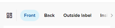
| Name | Default value | Value type | Description |
|---|---|---|---|
--pf-comp-toolbar-surface |
--pf-sys-neutral-surface-50 |
color, valid RGB, RGBA, HSL, HSLA color values and CSS4 Hex notation | Toolbar surface color |
--pf-comp-toolbar-on-surface |
--pf-sys-neutral-900-on-surface-50 |
color, valid RGB, RGBA, HSL, HSLA color values and CSS4 Hex notation | Color on toolbar |
--pf-comp-toolbar-vertical-divider |
--pf-sys-border-on-background |
color, valid RGB, RGBA, HSL, HSLA color values and CSS4 Hex notation | Toolbar vertical divider color. Separates actions buttons from placement tabs |
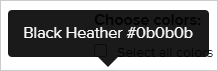
| Name | Default value | Value type | Description |
|---|---|---|---|
--pf-comp-tooltip-surface |
 hsl(0, 0%, 0%) |
color, valid RGB, RGBA, HSL, HSLA color values and CSS4 Hex notation | Tooltip surface color |
--pf-comp-tooltip-on-surface |
 hsl(0, 0%, 100%) |
color, valid RGB, RGBA, HSL, HSLA color values and CSS4 Hex notation | Color on tooltip surface |
--pf-comp-tooltip-opacity |
0.9 |
valid opacity value from 0.0 (invisible) to 1.0 (fully visible) |
Tooltip opacity |
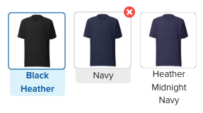
| Name | Default value | Value type | Description |
|---|---|---|---|
--pf-comp-variant-area-item-selected-border-color |
rgba(17, 100, 169, 0.6) |
color, valid RGB, RGBA, HSL, HSLA color values and CSS4 Hex notation | Selected item border color |
--pf-comp-variant-area-item-border-color |
--pf-sys-neutral-300-on-background |
color, valid RGB, RGBA, HSL, HSLA color values and CSS4 Hex notation | Item border color |
--pf-comp-variant-area-item-hover-text-box-surface |
--pf-sys-neutral-surface-200 |
color, valid RGB, RGBA, HSL, HSLA color values and CSS4 Hex notation | Item text box color on hover |
--pf-comp-variant-area-item-hover-text-box-on-surface |
 --pf-sys-neutral-900-on-surface-200 |
color, valid RGB, RGBA, HSL, HSLA color values and CSS4 Hex notation | Selected item text color on hover |
--pf-comp-variant-area-item-selected-text-box-surface |
hsl(195.48, 75.61%, 91.96%) |
color, valid RGB, RGBA, HSL, HSLA color values and CSS4 Hex notation | Selected item textbox color |
--pf-comp-variant-area-item-selected-text-box-on-surface |
--pf-sys-action-button-selected-on-surface |
color, valid RGB, RGBA, HSL, HSLA color values and CSS4 Hex notation | Selected item text color |
[1.9.1] - 2025-04-30
- Added preselectedProductOptions option that allows to define which Product Options are going to be preselected when Embedded design maker opens. If Product has these Product Options available.
[1.9.0] - 2025-04-02
- Added option to trigger Custom external file library
- Added option to Change locale
- Added option to Disable variant selection
- Added option to Limit color selection to one
- Added option to Limit size selection to one
- Added option to show Error modals
- Added callback for live price calculation Design pricing info
- Updated notes as to how to edit saved Templates
[1.8.3] - 2024-06-17
- Added product variant unavailability component variant unavailability component
[1.8.2] - 2024-05-24
- Added product unavailability overlay
[1.8.1] - 2023-07-31
- Added Mockup view section
[1.8.1] - 2023-07-31
- Added Mockup view section
[1.8.0] - 2023-06-20
- Renamed
--pf-sys-background-hsl-darkertoken to--pf-sys-neutral-surface-50-hsl- Neutral colors on neutral 50 surface - Added new neutral 100 color system tokens - Neutral colors on neutral 100 surface
- Added disabled action button color system tokens - Action button
--pf-sys-action-button-disabled-surface--pf-sys-action-button-disabled-on-surface
- Added component tokens
- Designer mockup area
- Header
- Mobile footer
- Mobile header
- Sidebar content
- Sidebar navigation
- Toolbar
--pf-comp-toolbar-surface--pf-comp-toolbar-on-surface---pf-comp-toolbar-vertical-divider
[1.7.5] - 2023-06-18
- Added
applyImageFromUrlparameter toPFDesignMakerinitialisation parameter list in Creating the Embedded Design Maker Manager class instance table - Added
applyImageFromUrlparameter description in "applyImageFromUrl" parameter section - Added
setUrlImageLayermessage description to Send message - Add image from URL trigger for message usage
[1.7.4] - 2023-05-30
- Added ability to customize UI border radius Border radius
[1.7.2] - 2023-05-16
- Made
silentErrorsto be included inerrorsparam for onDesignStatusUpdate method onDesignStatusUpdate method - call logic and returned data structure that describes current issues with design process if there are any
[1.7.1] - 2023-05-11
- Added information about case where order is put on hold due to printfiles being generated.
[1.7.0] - 2023-05-10
- Added section "Swap product used in product template" that allows you to duplicate existing template with the different product.
[1.6.5] - 2023-05-09
- Changed pf-comp-button-tertiary-border-color (border color change)
[1.6.4] - 2023-04-24
- Added default values for all "featureConfig" parameters in "featureConfig" data structure table
- Added
has_external_user_file_libraryparameter to show or hide customer file library "featureConfig" data structure - Updated
has_color_group_inside_labelsparameter description in "featureConfig" data structure
[1.6.3] - 2023-04-17
- Added variant area tokens Variant area
[1.6.2] - 2023-04-17
- Added new background token
--pf-sys-background-hsl-darkerin General background related tokens token list
[1.6.1] - 2023-04-05
- Added
errorsparameter in callback for onDesignStatusUpdate method onDesignStatusUpdate method - call logic and returned data structure that describes current issues with design if there are any
[1.5.0] - 2023-03-06
- Added
external_customer_idparameter to the/embedded-designer/noncesendpoint
[1.4.0] - 2023-03-01
- Added section "Get Compatible products"
[1.3.0] - 2023-02-10
- Added styling options
[1.2.1] - 2023-02-06
- Added
has_color_group_inside_labelsoption to FeatureConfig
[1.2.0] - 2022-11-24
- Updated sample order flow to mention order item creation from Product Templates.
- Updated the initial expiration period of a nonce.
- Documented getting a product template information by Product Template ID.
[1.1.6] - 2022-10-10
- Added
preselectedColorsoption that allows to define which Product colors are going to be preselected when Embedded design maker opens - Added
preselectedSizesoption that allows to define which Product sizes are going to be preselected when Embedded design maker opens - Added
disabledColorsoption that allows to define which Product colors are going to be disabled for Embedded design maker - Added
disabledSizesoption that allows to define which Product sizes are going to be disabled for Embedded design maker - Added
tabs.productTab.imageIconstyling option that allows to change Product tabs icon to a specific image - Added
tabs.designTab.imageIconstyling option that allows to change Design tabs icon to a specific image - Added
tabs.active.borderTopstyling option - Added
tabs.hover.borderTopstyling option
[1.1.5] - 2022-10-06
- Added
technique_key,technique_display_namefields to PlacementType
[1.1.4] - 2022-09-27
- Added
embroidery_3d_puffoption to FeatureConfig
[1.1.3] - 2022-09-21
- Added
disabledPlacementsoptional init property for PFDesignMaker class - Added section "disabledPlacements" array
[1.1.2] - 2022-07-27
- featureConfig property is now optional - by default all features will be enabled
- Added section "featureConfig" data structure
- Small updates in the documentation
[1.1.1] - 2022-06-30
[1.1.0] - 2022-06-16
- Added
onDesignStatusUpdateinit property for PFDesignMaker class
[1.0.2] - 2022-06-02
- Added a sample EDM screenshot
[1.0.1] - 2022-06-02
- Fixed Mockup Generator endpoints
[1.0.0] - 2022-05-17
- Initial version of the Embedded Design Maker documentation